Case Study - GourMî
The idea was to create a mobile app for users to browse restaurants and book reservations . . . beyond that it was up to the research to identify a target user and design an app that met their needs.

User Research
Using Directed Storytelling, I interviewed 3 participants about their past experiences browsing restaurants and booking reservations online. From the data collected, I was able to identify the following…
Commonalities
Participants wanted to be able to brows restaurant’s photos and menus before making a reservation
All participants have a list of restaurants they want to visit and are usually deciding between those places
Get restaurant ideas via word of mouth, friends
Get restaurant ideas via online resources (Google, City Pages, social media)
If they are going to the bother of making a reservation at all, then it is either a special restaurant, a special occasion, or both.
Only visits local restaurants, no chains
Differences
Gabby always knows exactly where she is going to book before beginning the reservation process, while James and Joél like to brows before hand
James and Gabby want to be able to make the reservation online, while Joel want to be able to call.
My user is influenced by social media and friends … they depend on word of mouth and other crowd sourced information for ideas on where to eat next…but before they go, they want to have an idea of what they are getting into…and when it comes to making the reservation, they want options and simplicity.
With this information, I created a user goal statement that encapsulated the needs of my user…
User Goal Statement
My user is a young urban adult “foodie” who wants to secure reservations at hard-to-book place in the metro area.
I wanted my user to be able to connect with other foodies, whether that is their friends in real life or other local foodies they discover using GourMî. They should be able to brows their content, read menus, see photos, and book a table in a space they have curated for themselves.
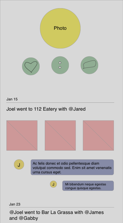
Below are my original sketches of the wireframes for 3 of the main screens of GourMî:
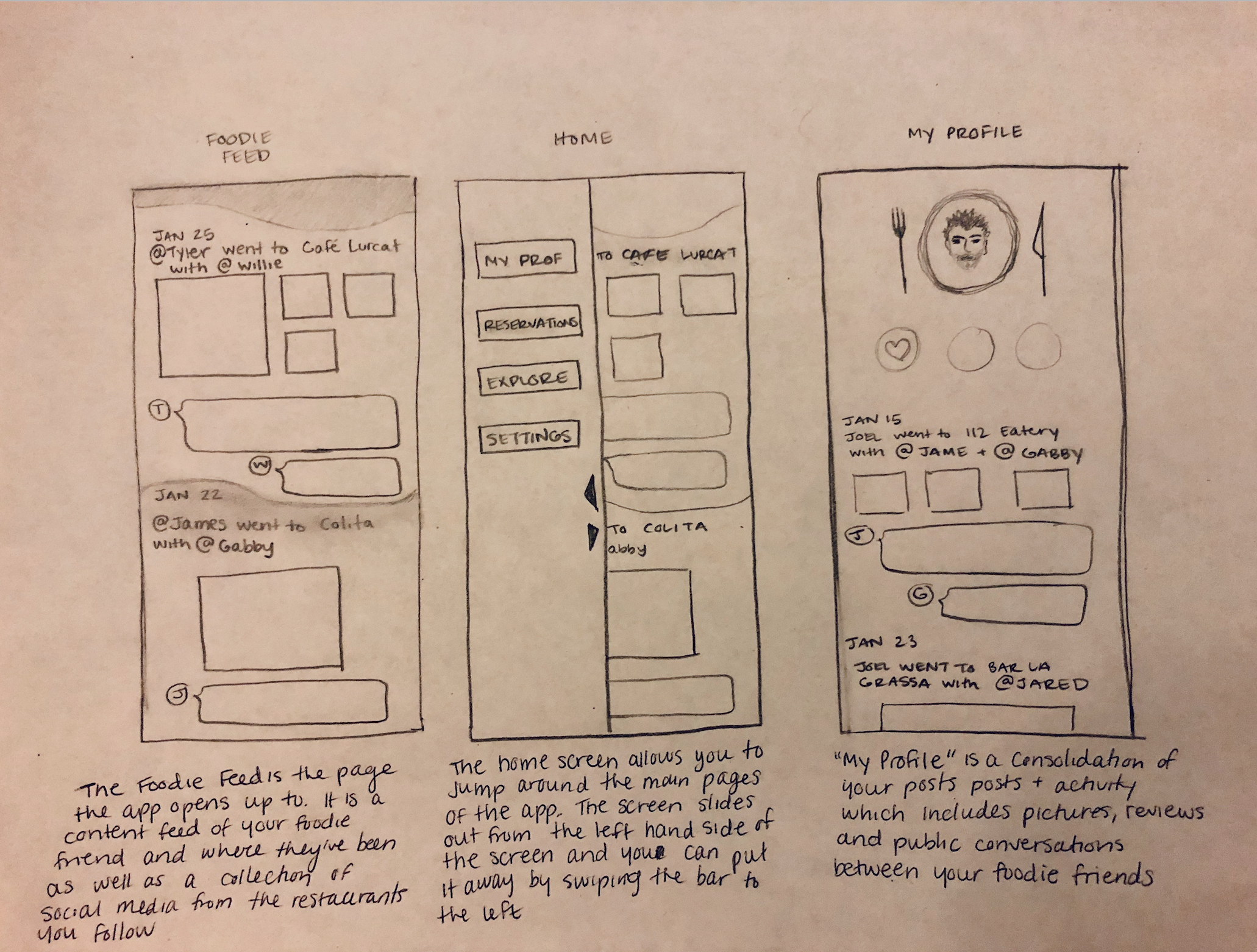
Sketched Wireframes
First digitized wireframes…
Revised prototypes…
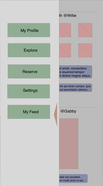
Beyond adding detail and replacing placeholder content, I made some changes to the navigation to follow design precedent that users are more comfortable with
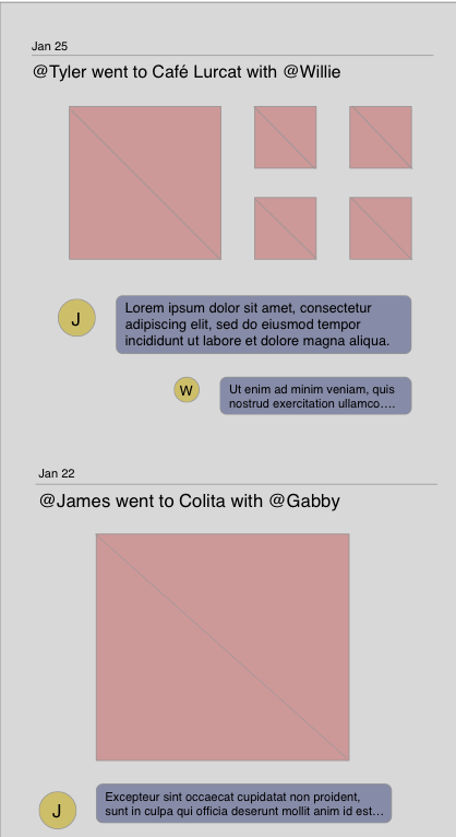
My Feed
I added a navigation bar to the new wireframes to increase the design familiarity and ease of use. Here is the home page that is also the users “feed”, where they can view the most recent posts of the people and restuarants they follow.
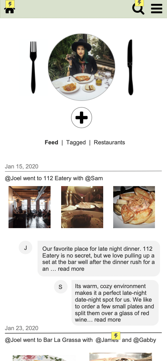
My Profile
It all begins with an idea. Maybe you want to launch a business. Maybe you want to turn a hobby into something more. Or maybe you have a creative project to share with the world. Whatever it is, the way you tell your story online can make all the difference.
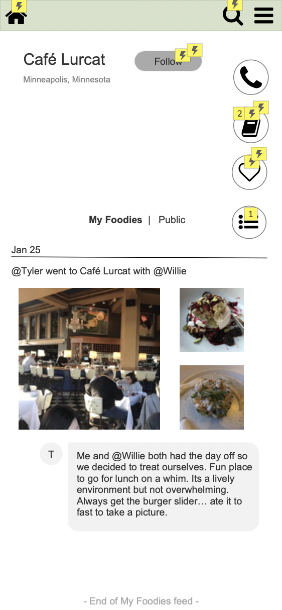
Restaurant Profile
I replaced the Navigation page with this restaurant profile page, where users can read content from the most recent patron, and they can filter that information to only view the experiences of the people they follow.
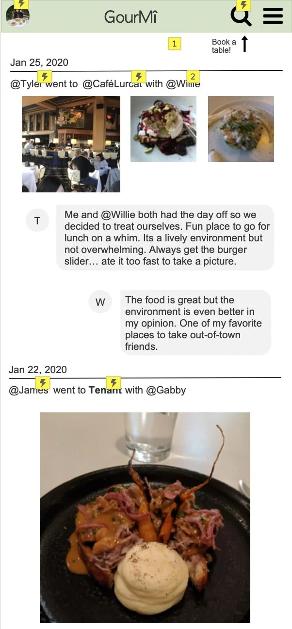
Usability Testing
Conducted usability testing with 3 new participants to determine areas for improvement within the app.
My participants varied in age, tech-fluency and native language. They were briefly interviewed then assigned a task to complete that would test the usability of the interactive prototype
Task: Book a table at a restaurant visited recently by one of the people you follow.
From this testing I determined that users had a hard time determining what on their news feed was a clickable link, which impacted the ability for them to interact with the content necessary to perform the assigned task
Recommendation:
Highlight clickable content to new users in the app tutorial
Redesign some content on the “my feed” page that makes it more clear what is a clickable link to improve usability