Multi-Touchpoint Design Strategy
Client: Craft Notes
Craft Notes seeks to build community by connecting lovers of craft food and drink to local businesses in Minnesota. They do this through their app and with their drink passports, both of which contain drink deals at the businesses Craft Notes has partnered with.
Deliverables
Research Summary
Design strategy map
Annotated wireframes
Methods
Research
Information Architecture
UX/UI
Wireframing
Prototyping
Tools
Sketch
Axure
Project Overview
The Challenge:
Craft Notes seeks to engage their users by building and showcasing a community of craft lovers and makers. For reasons we have been tasked to uncover, their current design strategy is not delivering on this and, as a result, is keeping the business from growing at the rate needed to meet their goals.
High Level Goals:
Strengthen the connection between touchpoints
Create a clear user path that facilitates membership creation and retention
Improve overall sense of community
“We just need to find a better way to tell our story”
— Craft Notes owner
Introduction
Craft Notes uses two main touchpoints to connect customers to their local businesses:
The Drink Passport
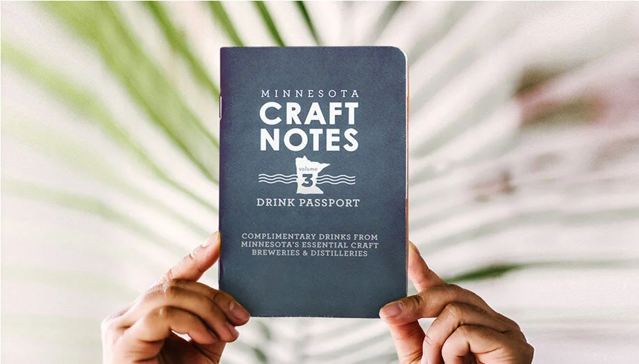
This booklet contains free drink vouchers that can be redeemed at some of the many makers Craft Notes partners with in Minnesota. The book contains information about the makers, local art and, of course, the drink vouchers. Its a one time purchase that also sets you up with a one-month trial of the app
The Craft Notes App
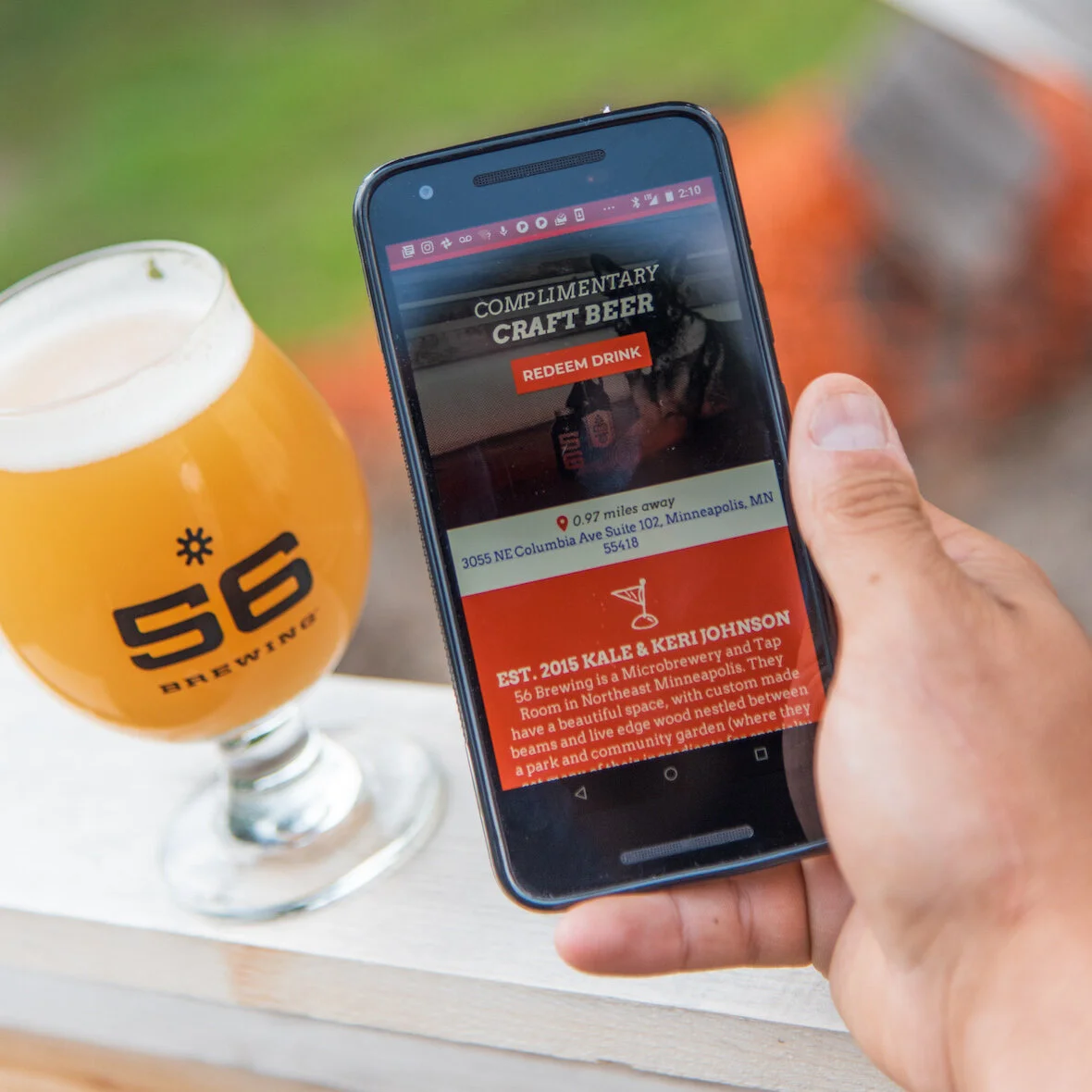
The app allows users to find Craft Notes makers closest to them. Members get 3 2-for-1s every day that they redeem through the app. Craft Notes also uses this space to features relevant events for users to brows through, connecting them to local happenings that may interest them.
Research + Discovery
Stakeholder Meeting
Our team met with the owner of Craft Notes to learn about business goals, known problem spaces, and to get a grasp on the current design strategy in place.
Key themes:
Quality - Value - Community - Discovery - Exploration - Support - Trust
Goals
Build a strong and visible community
Unifying touchpoints to stimulate engagement and create/retain more membership
Build trust with user by providing a high quality product
Attract customers interested and passionate about their mission
Build a design strategy and a business strategy that promotes national expansion
Improve site UI
Concerns
Balancing scalability and authenticity
Attracting a customer base that is mostly concerned with the “deal” aspect
Retaining customers after the monthly trial
Keeping the brand about the people
Getting partners to care about Craft Notes
Creating partnerships that people will trust
Repeat engagement of users with Craft Notes
Digging deeper
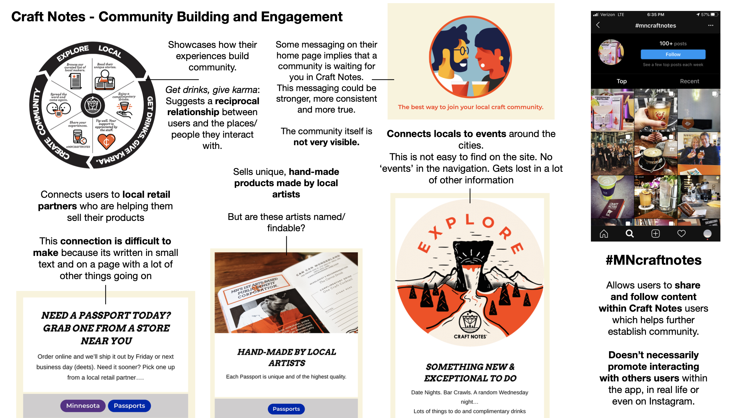
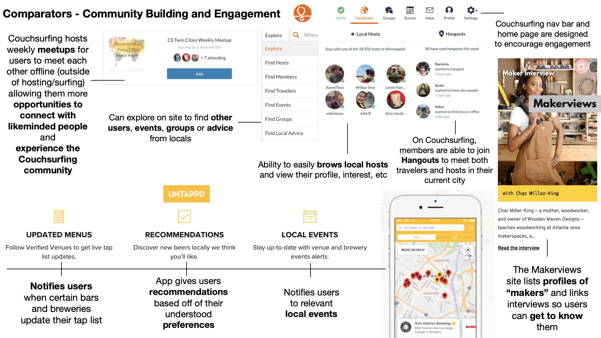
In order to gain a deeper understand of the problem space our client was operating in, we researched Craft Notes touchpoints alongside some of its comparators. My work was focused on looking for design strategies regarding community building and user engagement.
Craft Notes rapid research
Comparator rapid research
Define
What we found…
Craft Notes has a strong concept and a good foot in the door of the locals craft scene. Many of their touchpoints showcase a high level of professionalism that foster trustworthiness. The deals they have to offer are enough to justify a paid membership, but as we now know, Craft Notes is more concerned with gaining legitimacy as a resource to connect to the local community.
Strengths:
Concept
Content
App UI/design
Strong local partnerships
However, that isn’t coming through in the most important spaces. Their goal of framing themselves as a community resource is missed as you explore across the multiple, and somewhat disconnected, touchpoints. The app provides its users with incentives to visit bars and cafes, but the underlying value of supporting and fostering community is not there.
Opportunity spaces:
Visibility and value of their community
Strengthening social media presence as a useful touchpoint for users
Connection between their touchpoints (app, website, passport, social media)
Improve onboarding process
Usefulness and clarity of website
Design Strategy
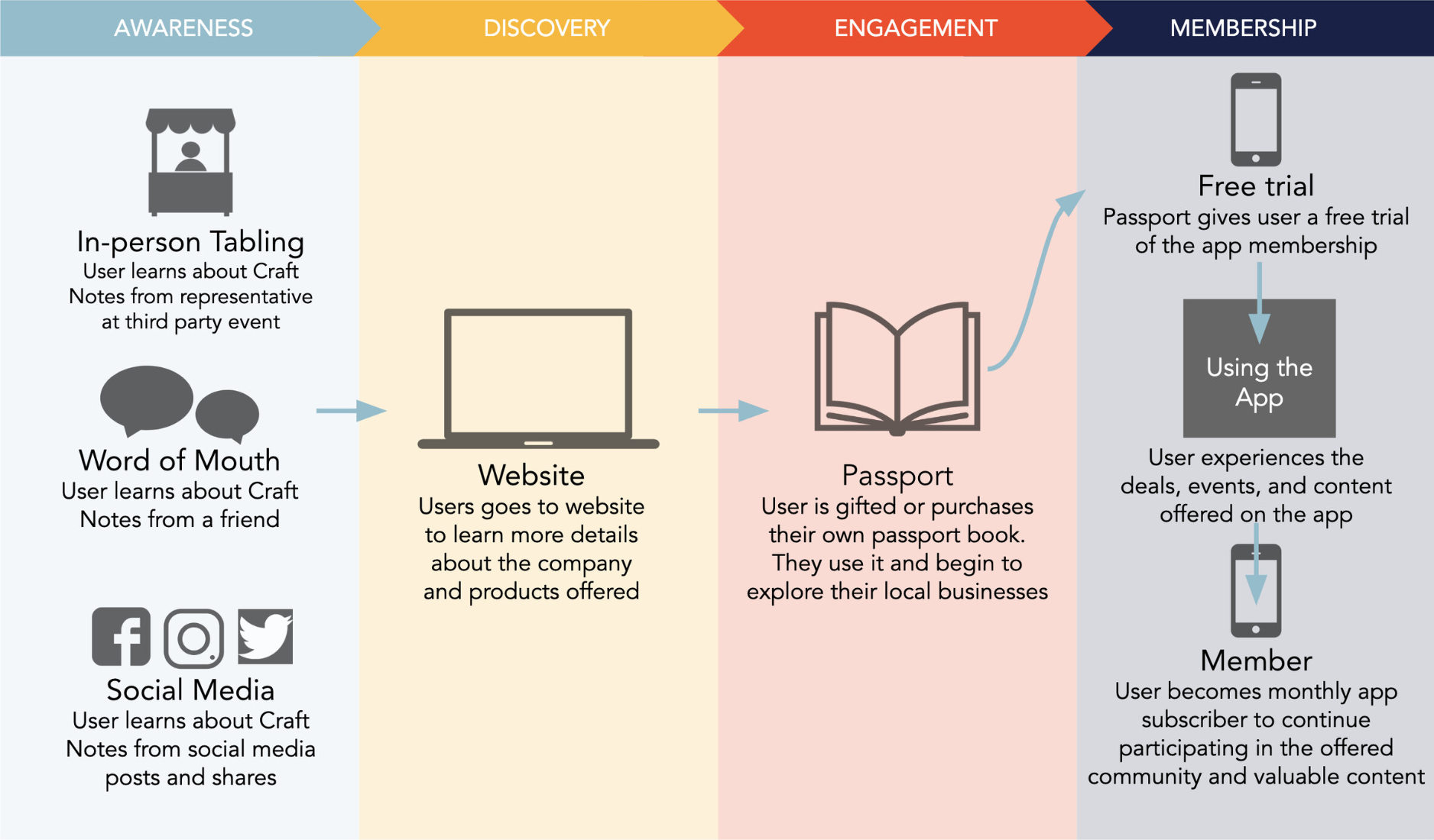
We created a design strategy that addresses these found opportunity spaces. By strengthening the connection between the touchpoints, improving navigation and building/refining content, users are more likely to experience repeat engagement that demonstrates membership value and is more likely to convert passport users and free-trial users to registered members.
Final UI
Defining awareness was an important step for us as a team to understand where the user was starting so we could frame those interaction in a way that got us to our next step: the website
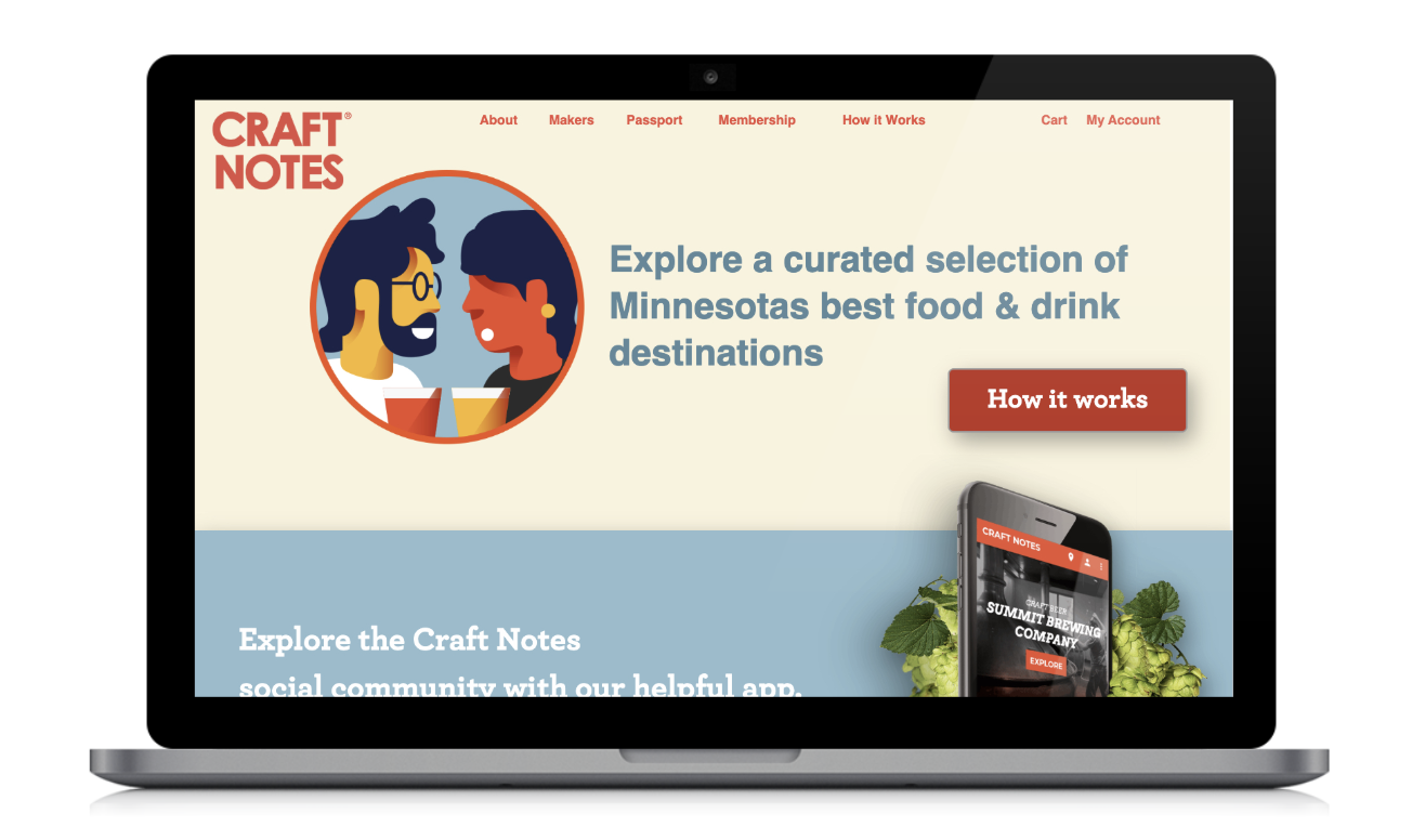
The first step of discovery in this user journey is the website. It has a wealth of information on how Craft Notes works, what it offers, and is the only virtual space for users to buy a passport.
The original design of the website lacked clarity and redundant information made it hard to understand what Craft Notes was trying to tell you at any given time.
More tabs were added to the navigation bar in order to improve website organization. The website is the place where key features can be explained to the user in detail (passport program, membership perks, etc.). We designed the the navigation bar strategically to highlight these features to make sure our users could easily come to understand how Craft Notes works.
For users, the passport is often the first step of true engagement with Craft Notes offerings. People nowadays are juggling more monthly subscriptions they can probably count, and the passport is a welcomed return to the physical realm. It is accessible and non-threatening, and it comes with a free monthly trial so customers can get their foot in the door and familiarize themselves with what our app has to offer. So during or after engaging with the passport, users would begin to explore the app
We see the app as the final touchpoint. It is the place where users can connect the most with their community. With a free trial from the passport, users are able to freely explore the site for what it has to offer.
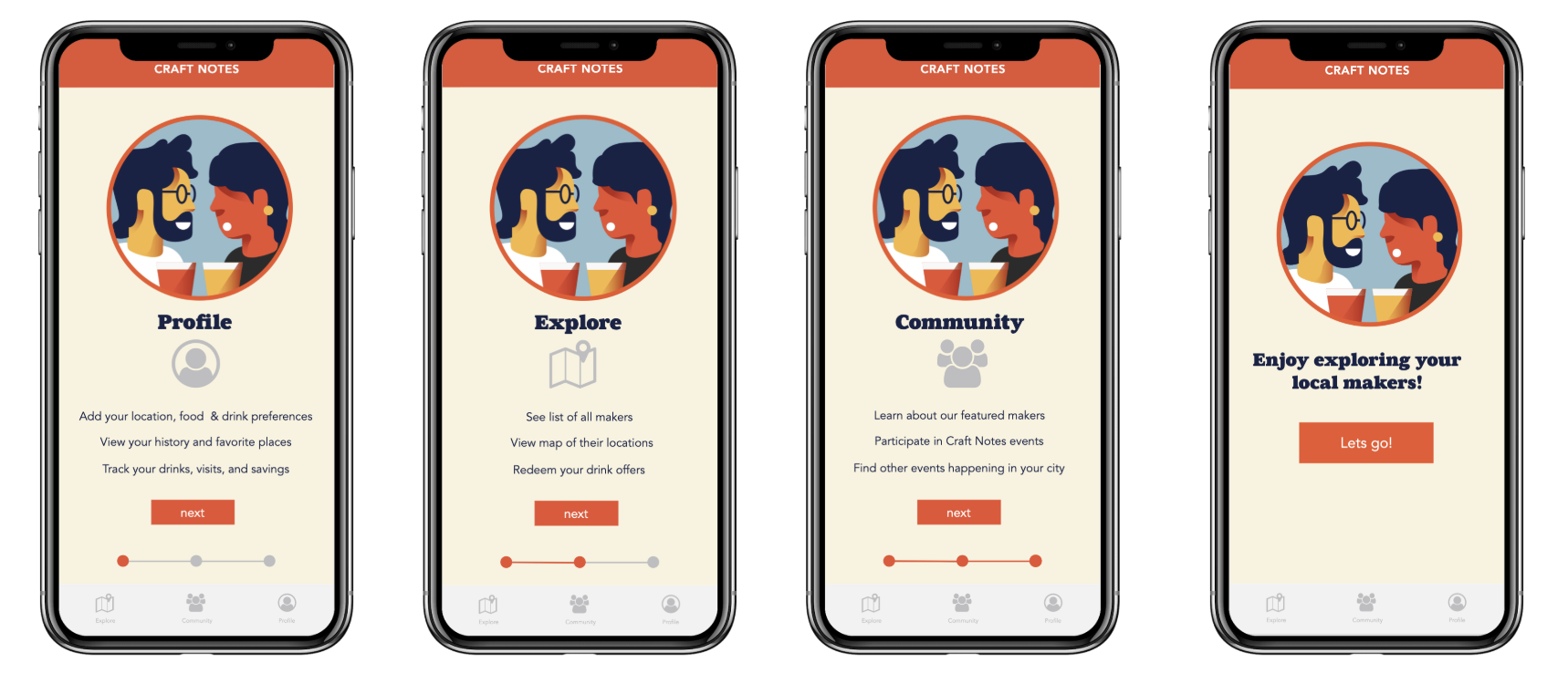
We added some an onboarding element that includes a brief tutorial and lays out what the user can expect to find once they get inside.
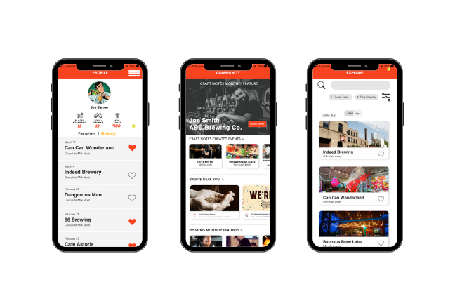
Before out changes, there was virtually no language within the app that highlighted community, so we gave it its own tab. This is where users can see featured events and Craft Notes curated events and meet ups (which was an idea we decided to lean into to enrich the community offerings within the app).
Within the explore tab we added filters for people to search for places that fit specific lifestyle needs like dog-friendly, gluten-free and vegan/vegetarian. This way members feel seen and app feels more personalized to them. Logistically, the app feels more useful when you can fit it to you or your party’s needs.

