UX and Design for GCI Customer Approval experience
I was asked to design a digital experience that occurs between a customer and a customer service representative (CSRs) at the end of purchasing of new mobile or internet service. The experience is intended to bring clarity for the customer as to how their new contract impacts their bill. Although this experience happens on two ends and two different device types simultaneously, the goal was to make them mirror each other as closely as possible.
My role: Create the UX and the UI design of the experience
Tools
Figma
Deliverables
User flow
Interactive design prototype
Project overview
The challenge:
Because the customer service representative was tasked with walking the customer through this process, either over the phone or in the store, the two digital experiences needed to mirror each other as closely as possible.
A challenge at the customer end of the experience was making sure that the changes to their contract were clear by including all the relevant information about their account while making it easy to digest.
High-level goals:
Create a seamless experience between the customer and customer service representative
Design an experience that fits the current GCI branding guide
Defining the experience
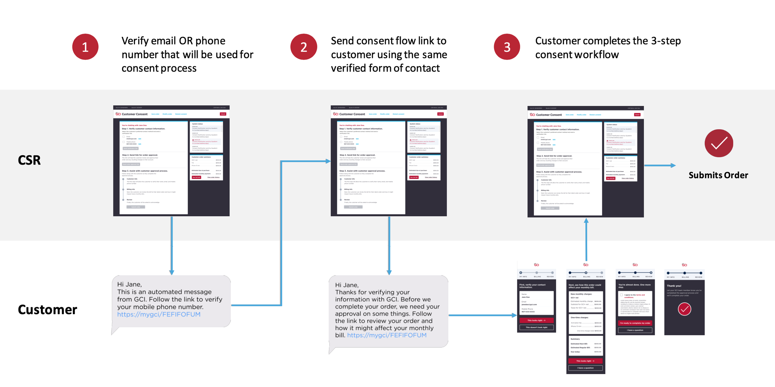
The first step was to make sure we understood the details of the interaction between the customer and the CSR, which included a mixture of in-person, text message and browser experiences on both desktop and mobile. So I crafted a user flow that architected that interaction. Below is a polished version of that user flow using future designs.
Wireframes
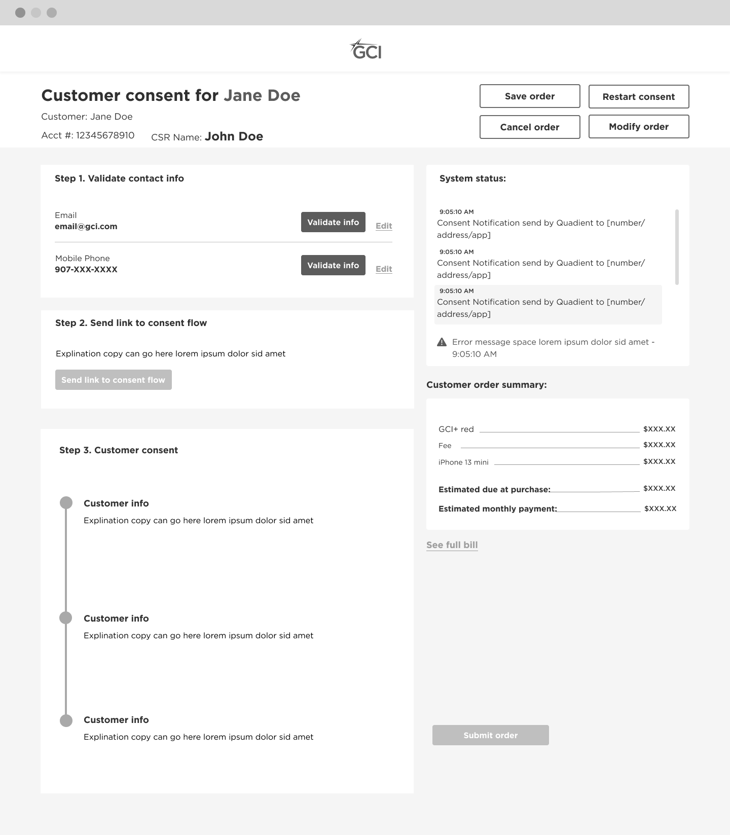
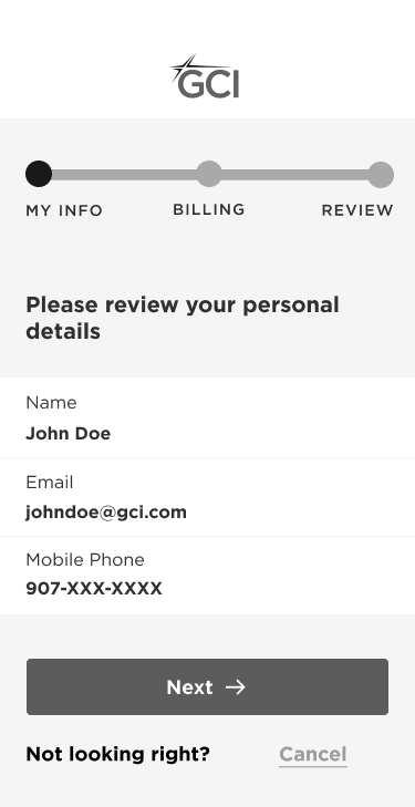
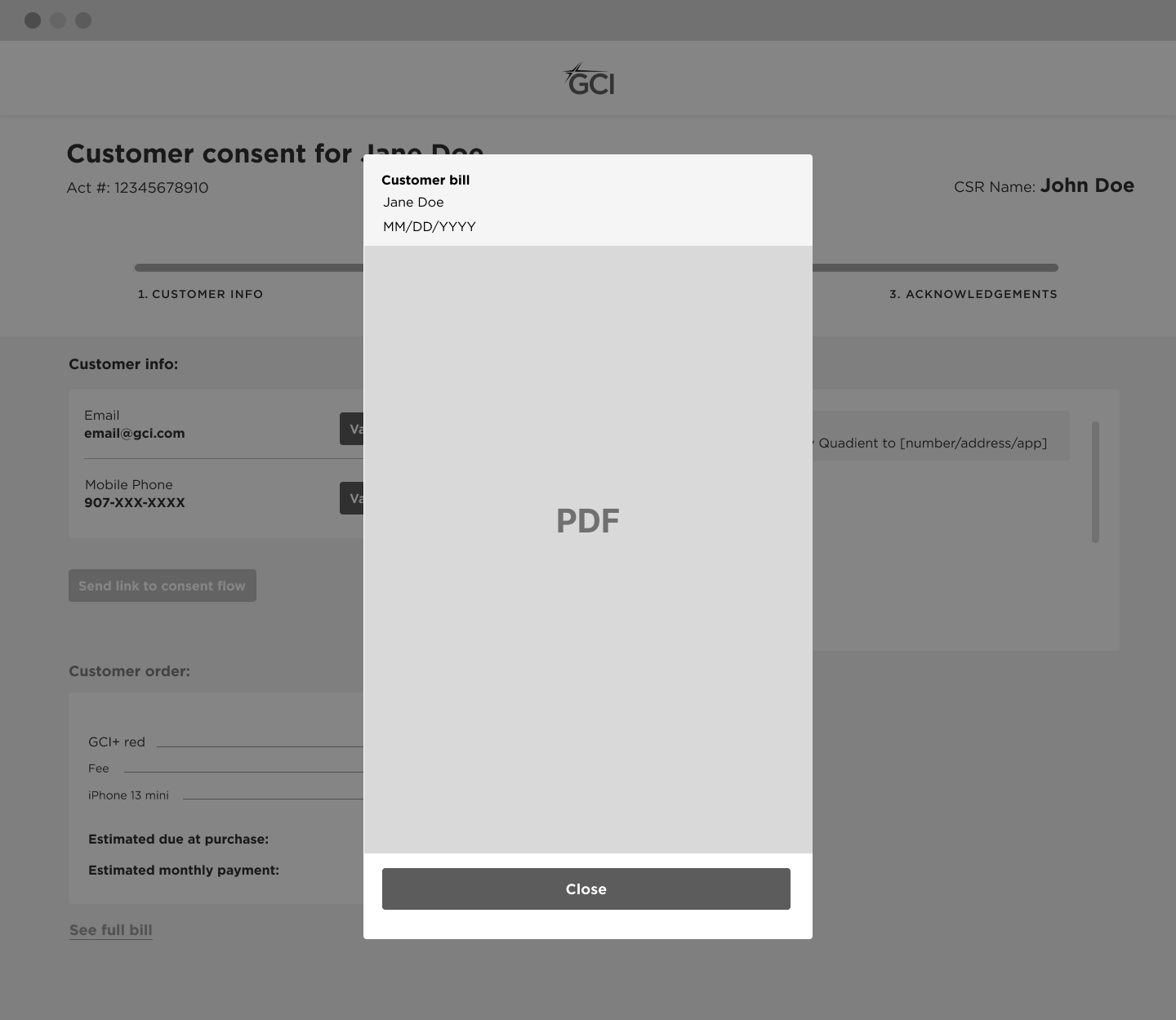
The wireframe stage is where lots of the conversations with the technology team happened as we got into more detailed interactions. This stage had a lot of iterations, particularly around what kind of troubleshoooting actions the CSR could take and how the billing details were shown to the customer at this step.
Adding visual design
The client wanted both the customer service representative and the customer to have a GCI-branded experience. So, I used the GCI style guide while also creating new design patterns and icons to bring more clarity and visual hierarchy to the experience.
We landed on a clean and synchronous experience between the customer and CSR that helped guide both users through to the end of the purchase experience. I presented these designs to our client in high-fidelity clickable Figma prototype as seen below.


