Launching the new flagship product bundle for Alaska’s biggest telecom company
GCI is Alaska’s #1 internet provider with their sights on capturing the mobile market. GCI+, their flagship product, was launched to help them achieve that by offering a bundled service of internet, mobile and TV at a reduced price. Partnering with my team at Horizontal, I was tasked with crafting the digital experience that would launch this product on their website.
Project Overview
The Challenge:
Creating a user-friendly plan builder experience for a complicated product with many customizations
Working within the parameters of a limited development budget
Lack of user insights to create MVP experience
High-level goals:
Design 3 product landing pages that tell a cohesive and digestible story about a complicated product.
Architect a plan builder and buy flow that combines 3 different services as well as a device shopping experience.
Create a strategy for how to market the new products throughout the site.
Lemon zest and sparkles (this will eventually make sense)
Deliverables
User flows
Wireframes
Research findings and recommendations report
Results:
Our MVP experience resulted in an overall 5.5% conversion rate (about double the average ecommerce conversion rate of 2.5 - 3%). We then conducted A/B testing to further improve the experience and ended up with a ~6.5% conversion rate.*
Tools
Figma
InVision Freehand
Whimsical
Methodologies
Secondary research
Interactive prototyping
User testing (A/B testing)
Usability testing
Market Research
We took a look at the market (both within telecoms, as well as outside the industry) to see how others were designing personalized plan building and product bundling experiences.
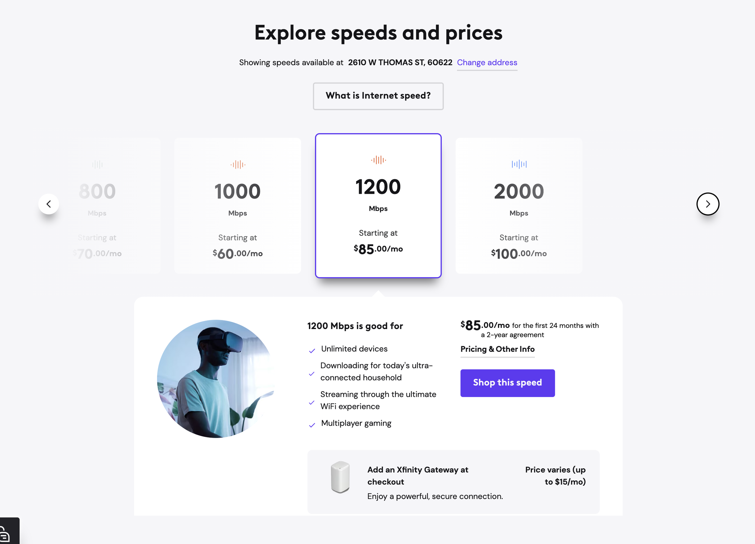
Picking the right plan with Xfinity
Providing “personas” and use-cases
Helps user translate technical jargon
Creating a customized vitamin and supplement packet with care/of
Quiz-like experience that collects information about you and your health goals
A bit lengthy but appropriate for the product
Fun and engaging experience
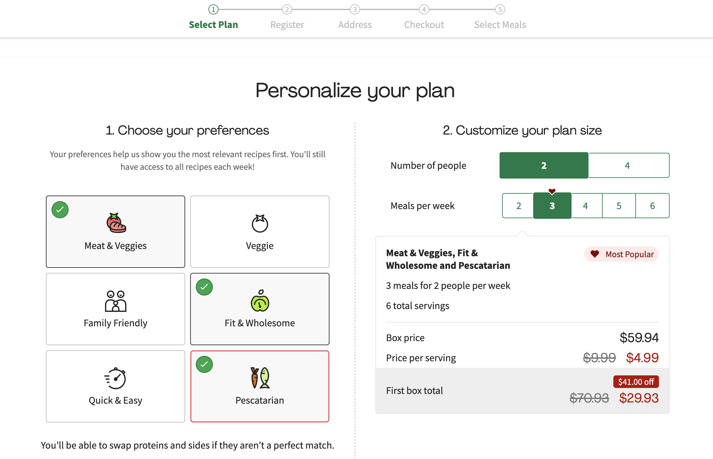
Building a meal plan with Hello Fresh
Concise experience that still brings customization and delight to the experience
Strategy and Execution
GCI+ Plan Builder
Tackling the plan builder for MVP launch was the most complicated piece of the project due to the product complexity, tech limitations, and technical requirements of the experience.
Thinking big: iteration 1
Taking inspiration from what I saw both in and out of the telecom category, I created a guided experience to help users find the plan that best fit their needs by answering a series of questions about their tech lifestyle.
This part of the experience didn’t end up being in the budget for MVP launch, but it became an aspirational experience that was eventually achieved down the line.
Iteration 2: Crafting the MVP experience
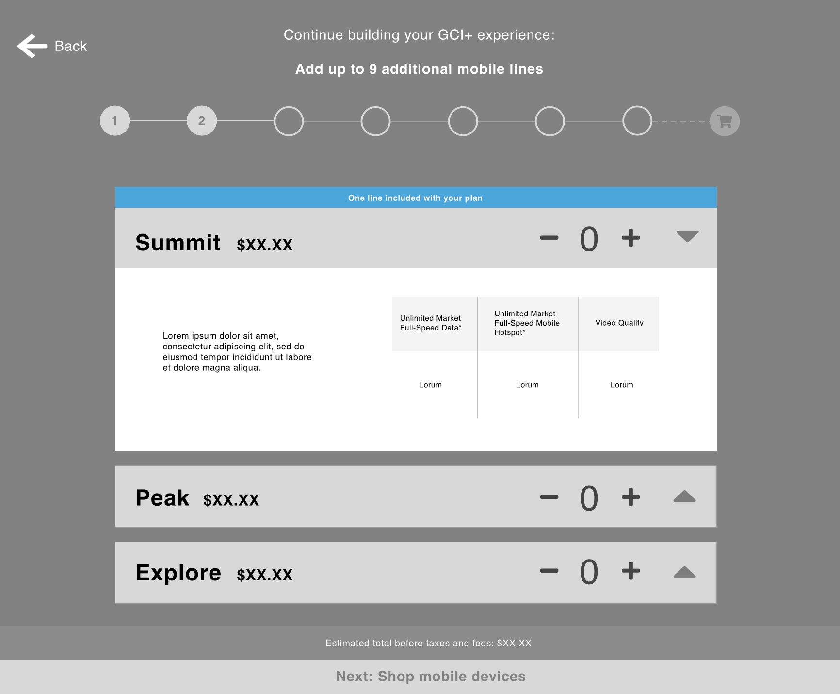
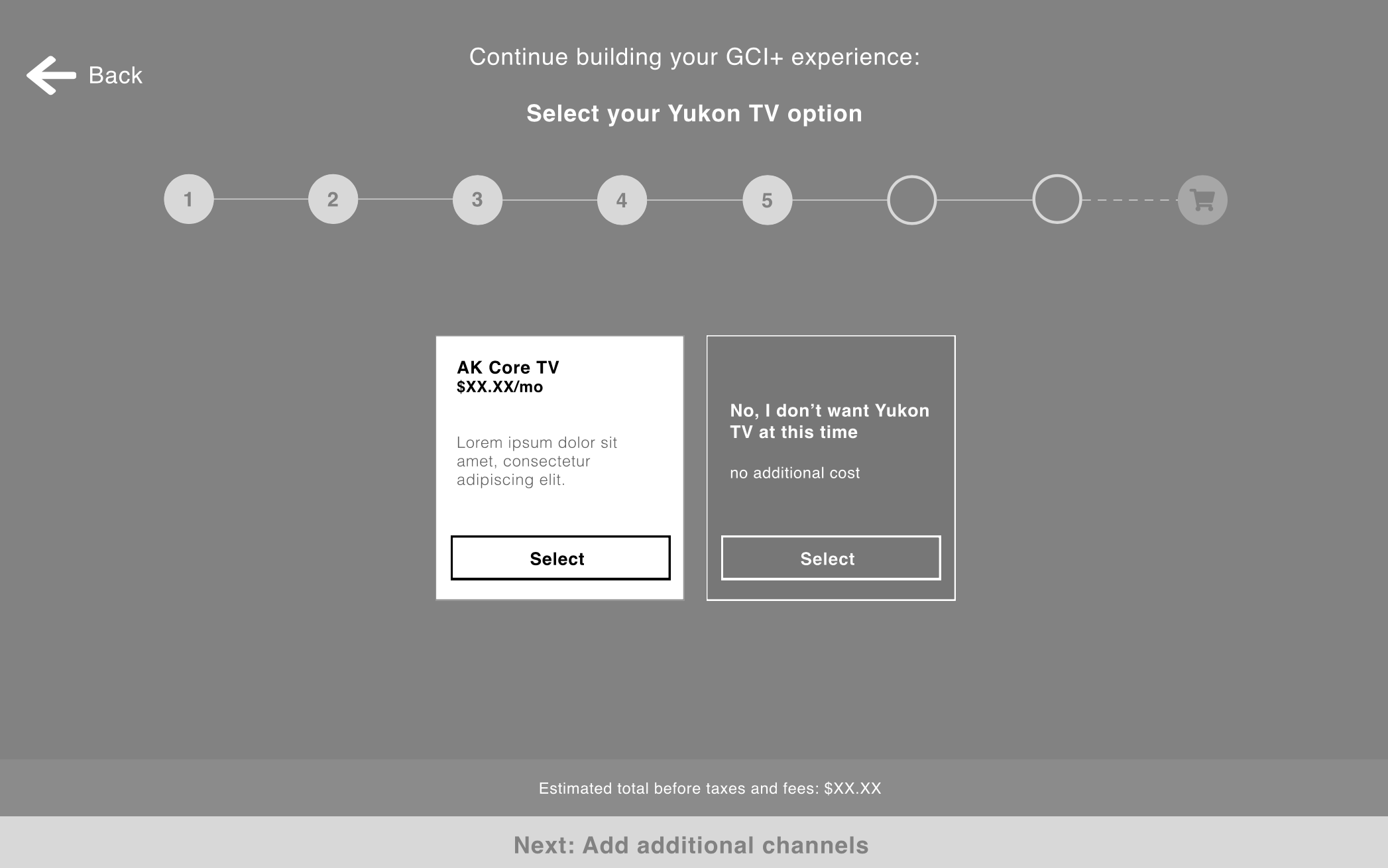
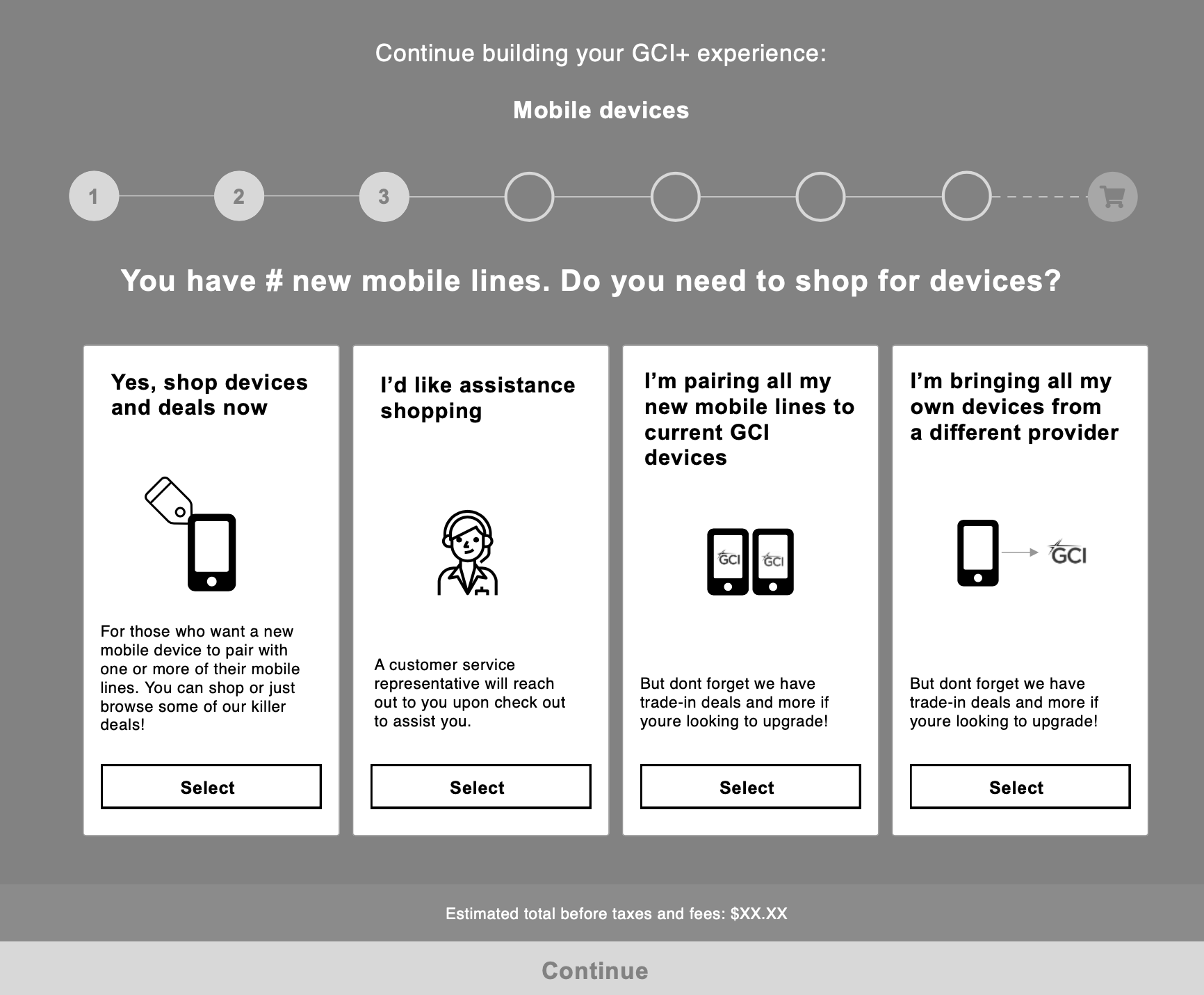
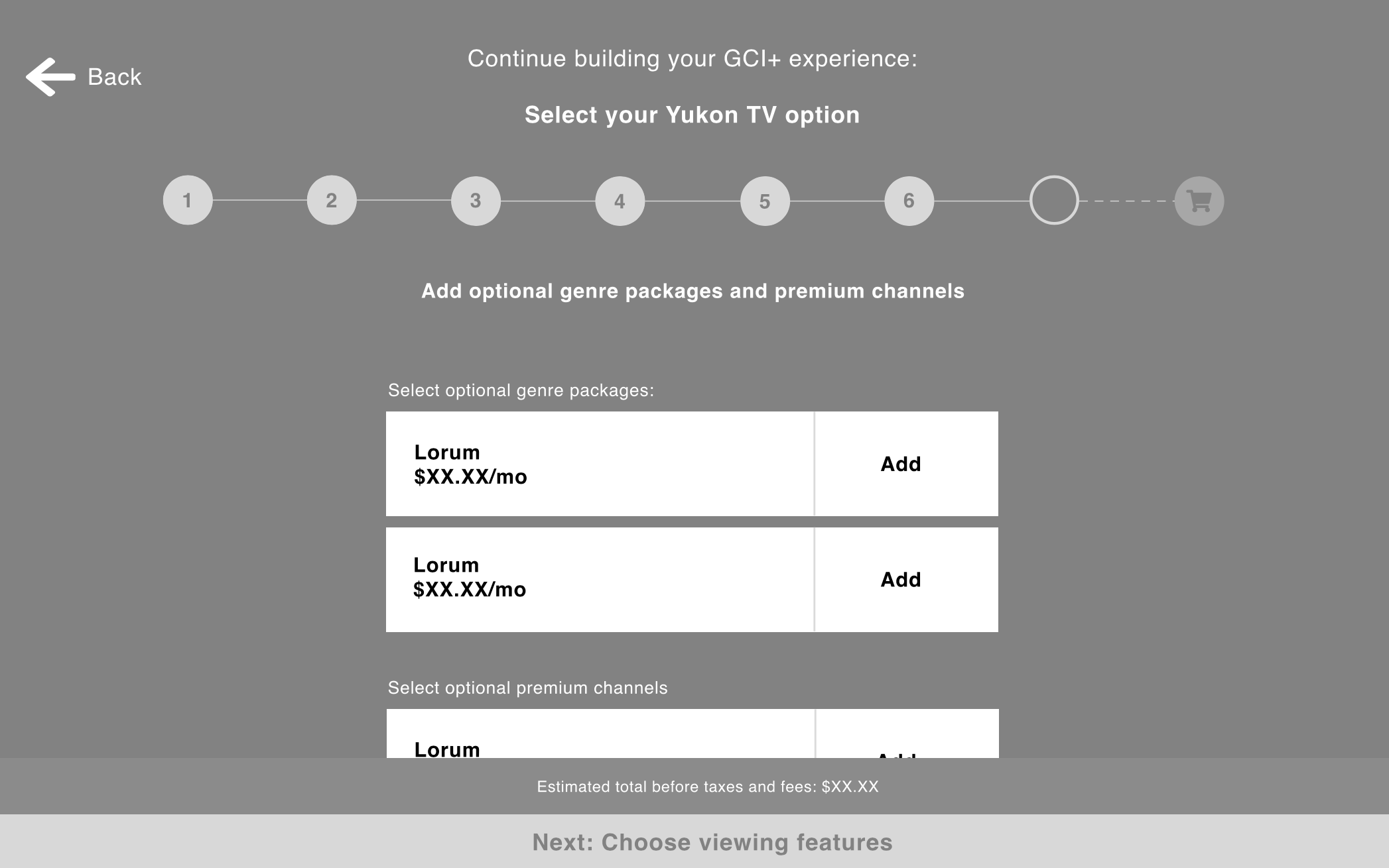
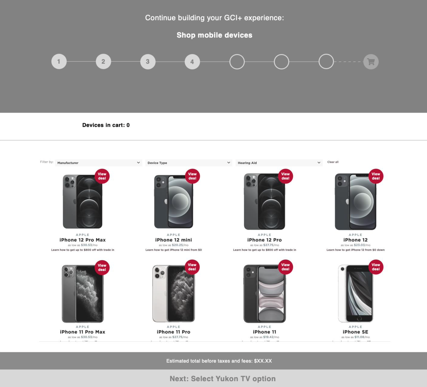
I pivoted to a more straightforward plan builder that was a lower development lift but still provided a guided experience
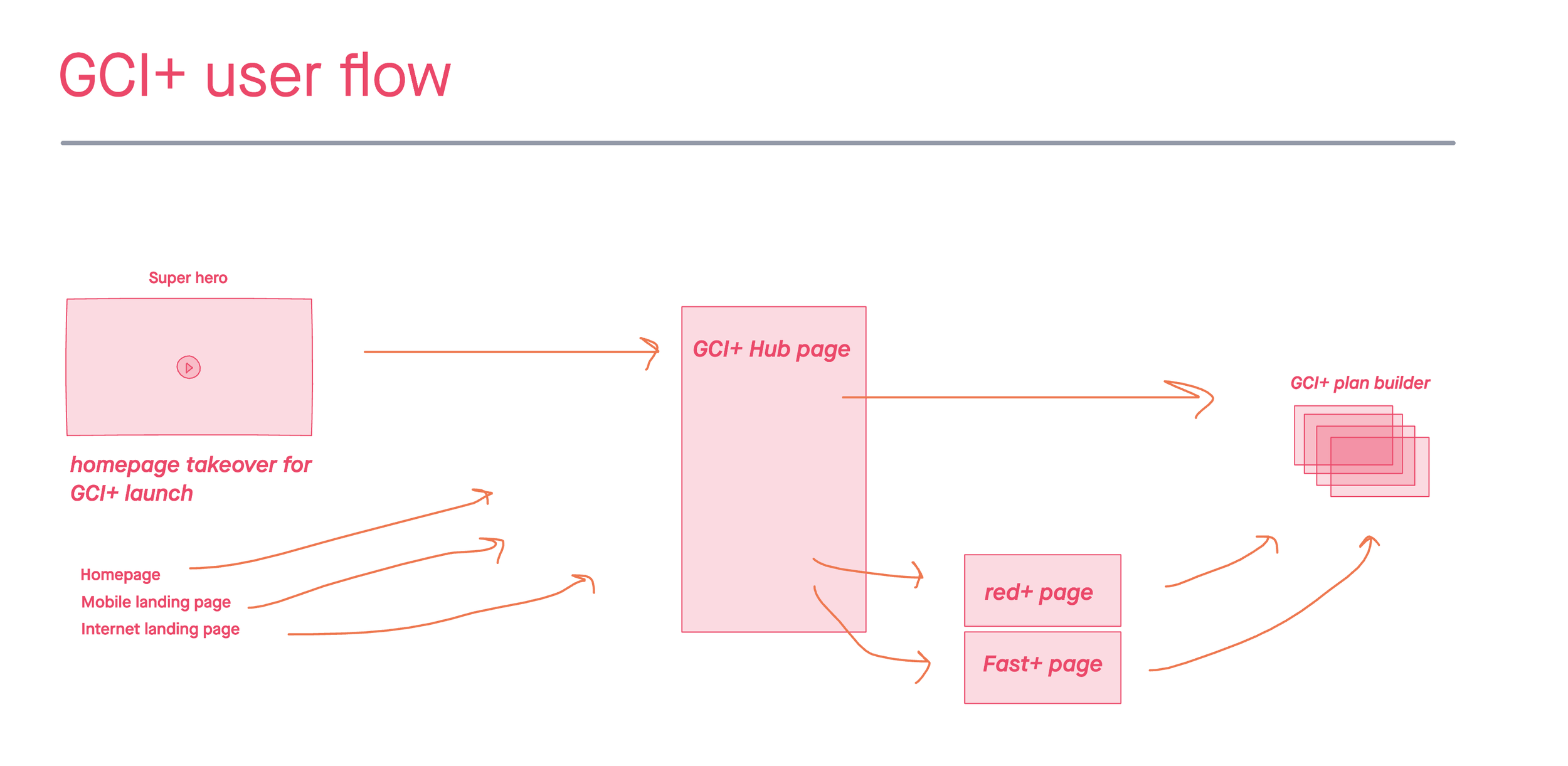
I architected the GCI+ at a high level by creating a user flow in InVision Freehand that indicated the different paths the user could take in the experince, starting with promotional drivers to the GCI+ landing page, and leading the user through the product landing pages and finally the plan builder experience.
My strategy
Break down the plan builder into steps
Allow users to completely bypass any steps that didn’t apply to them
Maintain a personalized feel similar to iteration 1 guided quiz experience
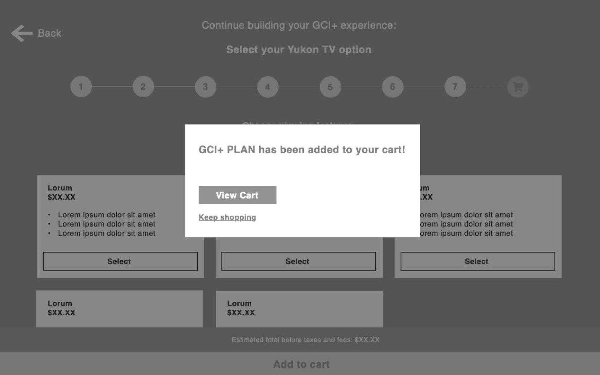
GCI+ plan builder and buy flow
Plan builder wireframes
User flows
GCI+ landing page
When designing the GCI+ landing page, a main consideration was that this was a brand-new product that needed to be introduced to the users in enough detail that they could understand, but without bogging them down with details and jargon.
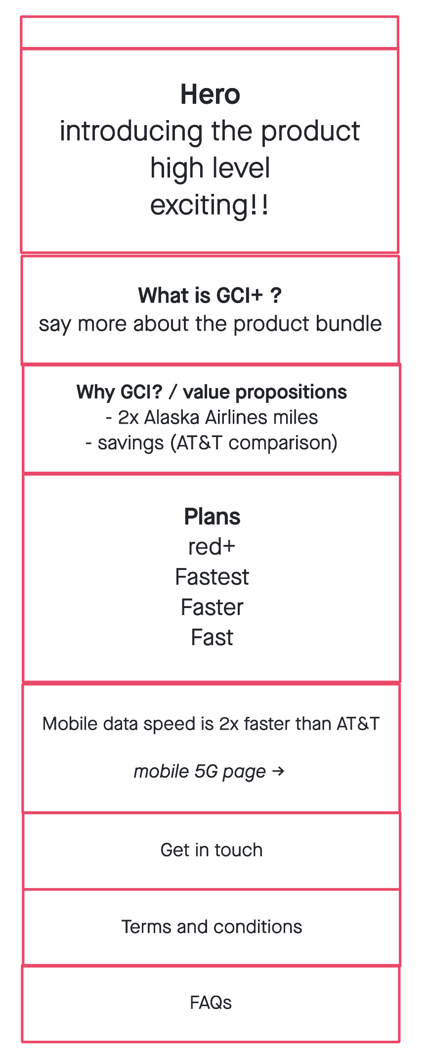
Content hierarchy
Goal: Get a firm grip on the hierarchy of page content.
Mid-fidelity Wireframe
Goal: Identify types of components to use to stell the story
High-fidelity Wireframe
Goal: Detailed, client-facing wireframes with directional copy
Design Recommendations
✧˖° Lemon zest and sparkles °˖✧
The GCI leadership team said this phrase repeatedly when speaking to us about what they want from the GCI+ digital launch. This was their way of saying they wanted the gravity of the product to be reflected in the web experience. This wasn’t just any product launch. This was thee product launch. They wanted it to feel singular, special and delightful.
As the UX designer, with the budget to only create one net new component (which would be used on the plan builder) I had to think of how to use the toolbox of components we already had to make a big, unique splash.
Zesty component solutions
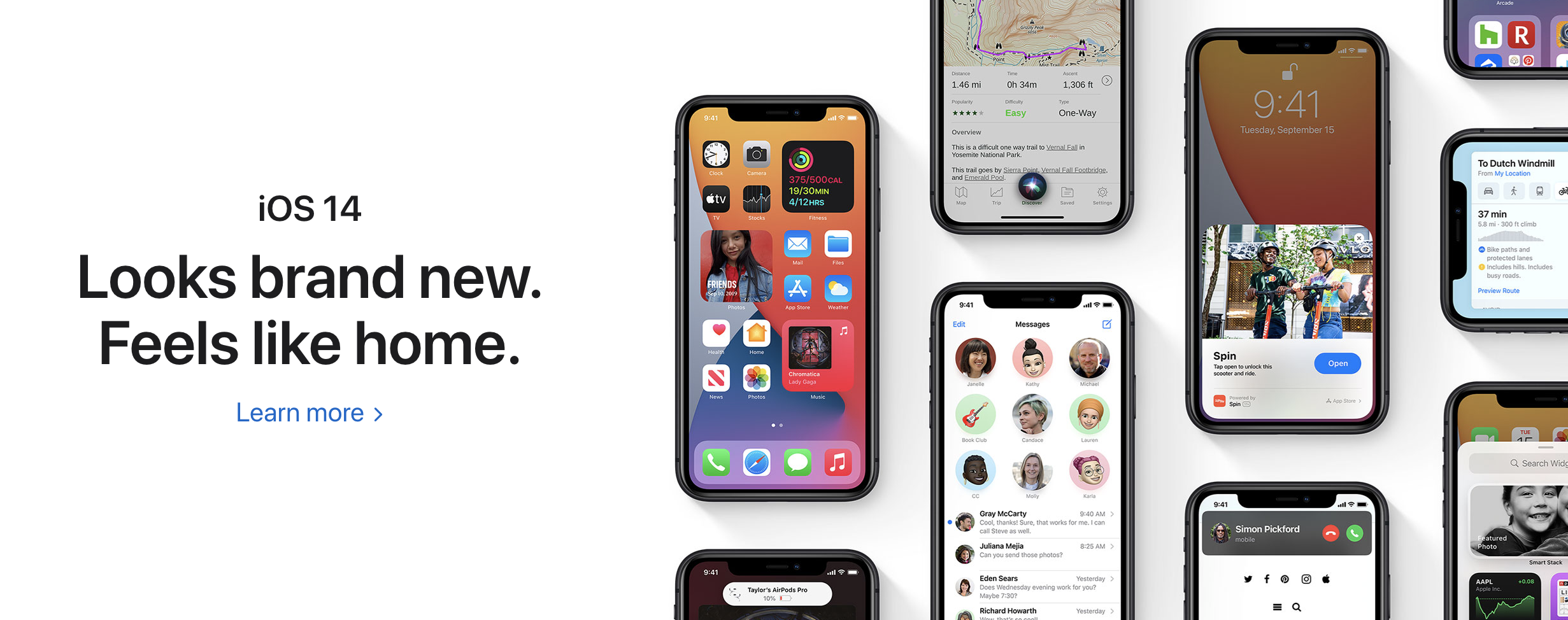
Taking inspiration from brands like Apple, I wanted to achieve an elevated look and feel that made GCI+ present like the stand out product it was.
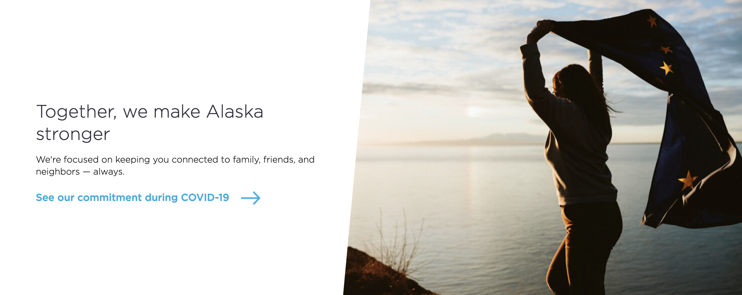
My solution was to use what we called a ‘slant module component’ (which was a 50/50 component that used a slated image) and “hack” it to give it the illusion of a floating icon or image to match this elevated Apple look.
Regular slant module component with GCI core branding:
Zesty slant module component with GCI+ branding:
Landing page in design
Testing and improving
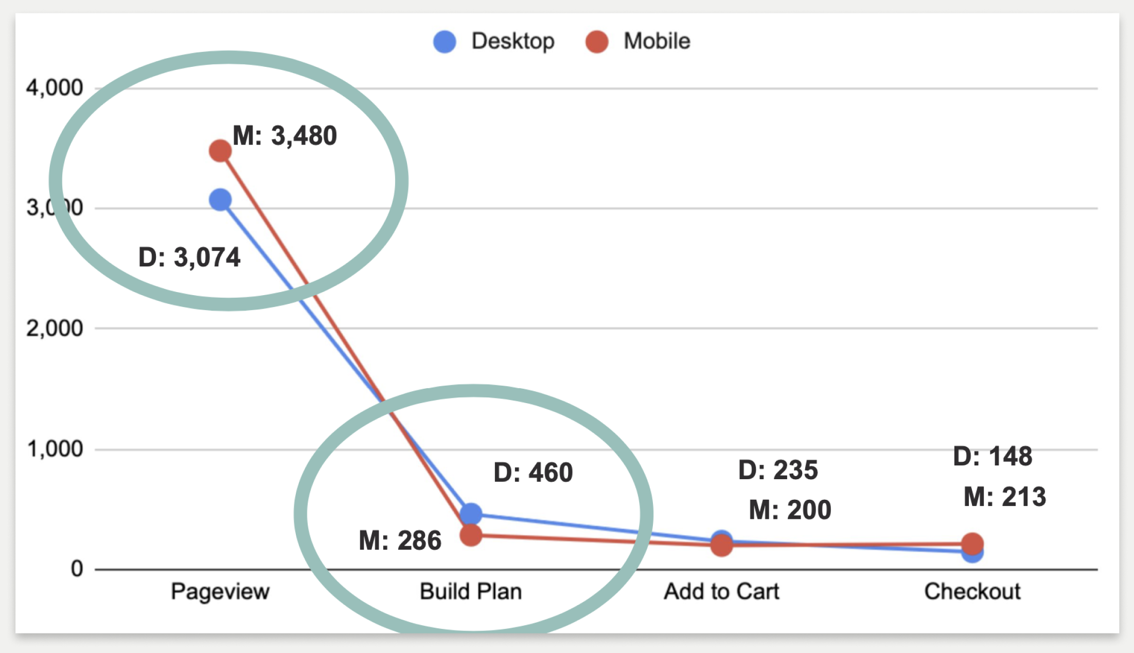
We started tracking the new experience in Google Analytics and Content Square to see how it was performing
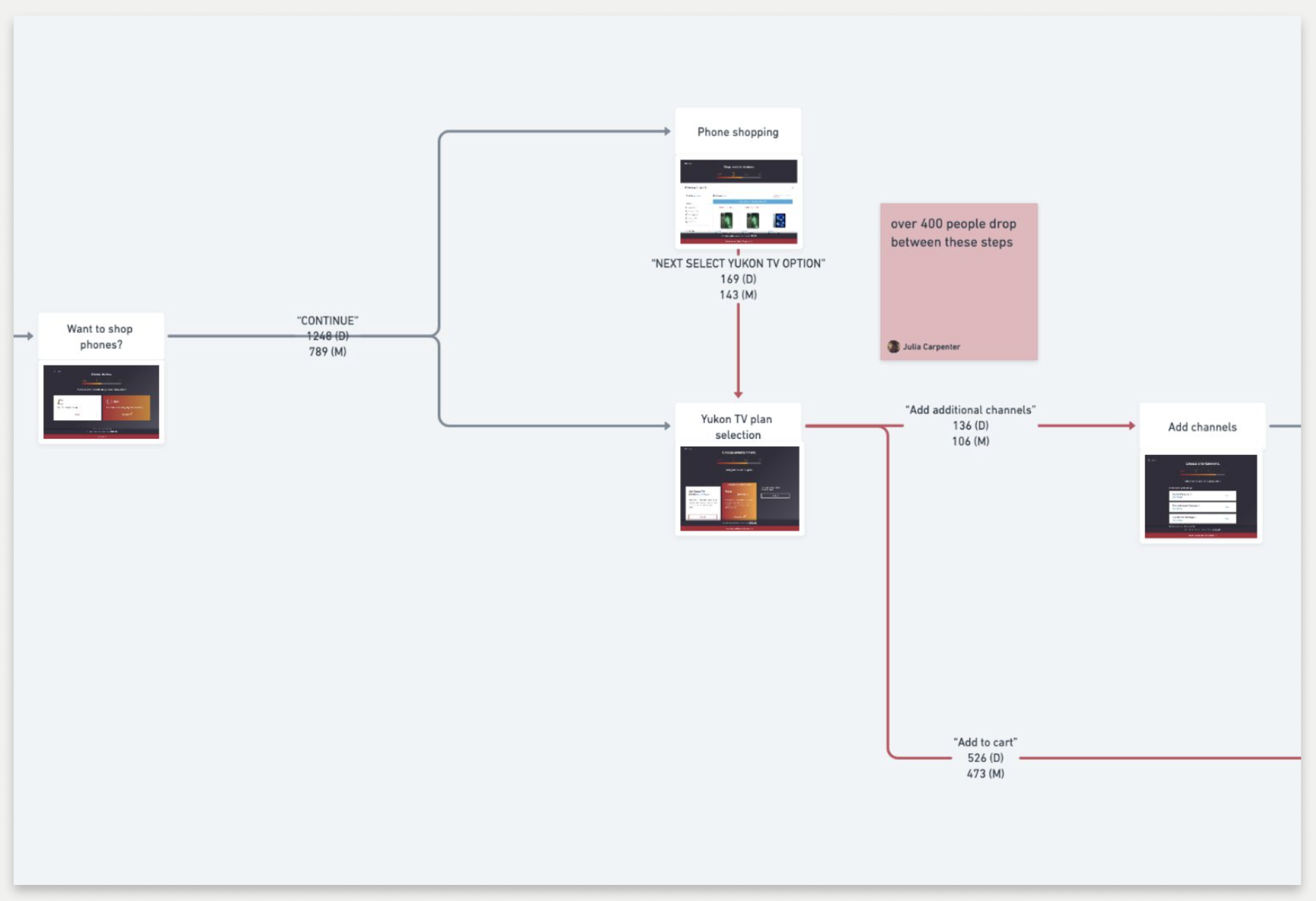
Click through from the GCI+ homepage into the plan builder experience and through to the checkout step
User flow depicting the click-through rate between the different steps of the GCI+ plan builder
What I observed:
Customers were ready to shop and did not lingering in the value proposition area of the page (which took up a lot of space)
There was a high click-through rate into the plan builder from the GCI+ landing page
Lots of users dropped out of the plan builder when asked if they wanted to add TV to their GCI+ bundle
We used this data to propose some improvements to the site
Recommendation:
Condense the value proposition of the page to a single component
Lower the priority of the GCI+ TV add on in the plan builder
My strategy:
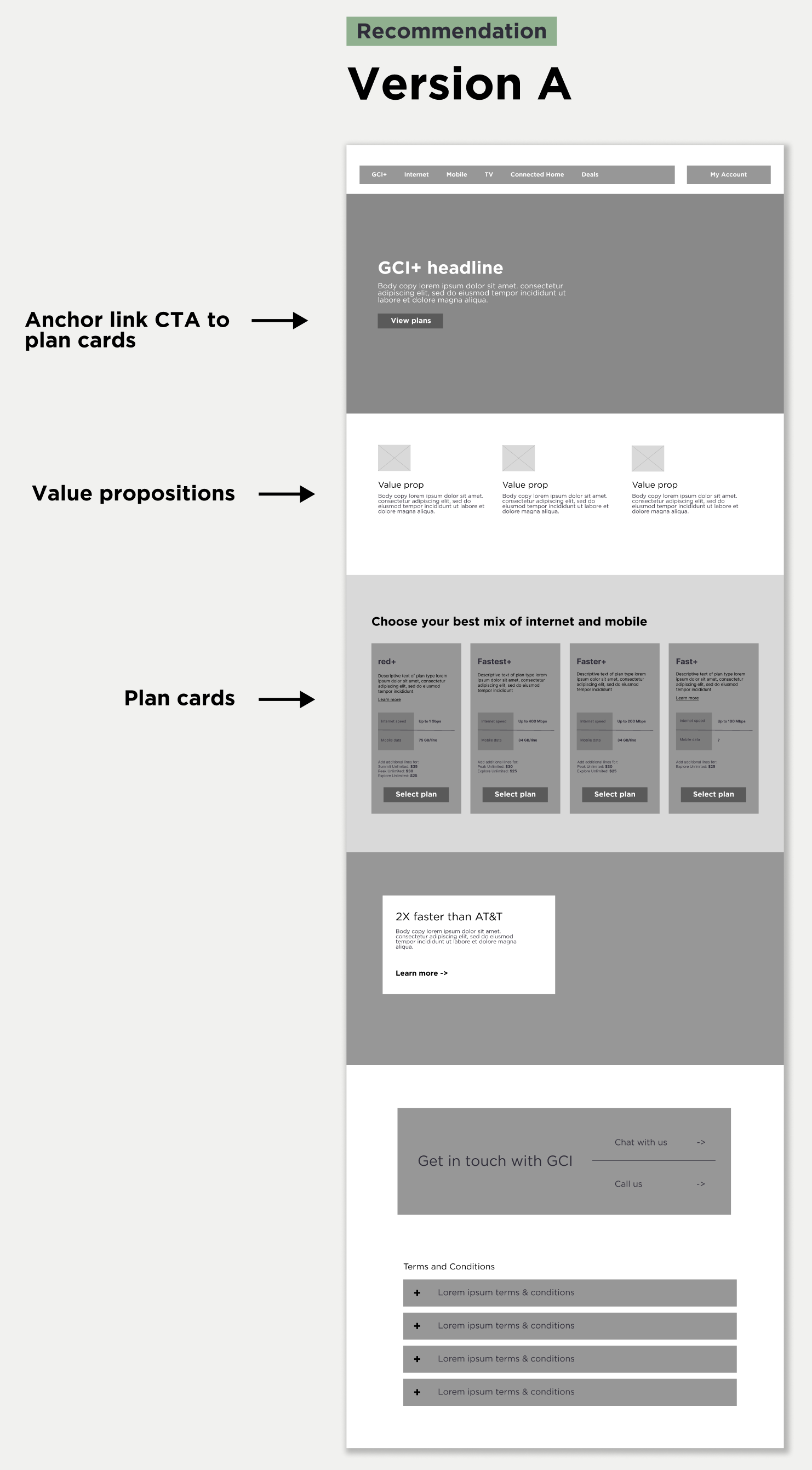
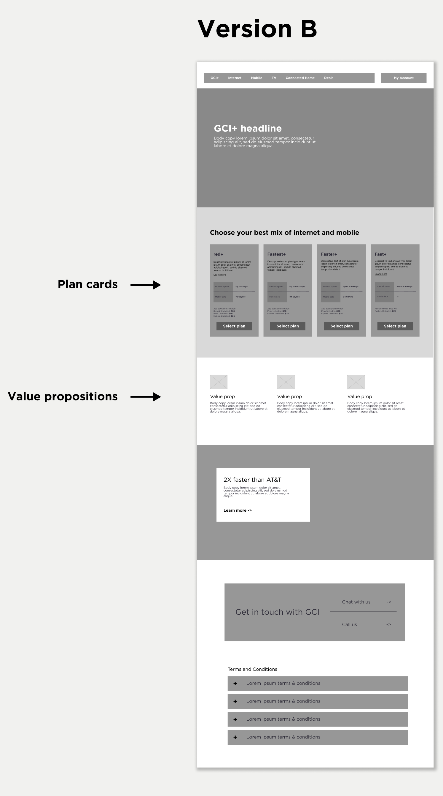
Start by A/B testing 2 versions of recommendation 1:
With the value propositions above the plan cards
With the value propositions below the plan cards
What we found:
Condensing the value props increased the click-through rate in either scenario, but conversion was ultimately better when they were placed above the plan cards. So we we went forward with that design.
The results
We ended up creating a more refined landing page experience that dramatically increased conversion (from 5.5% to ~7%) on the page while simultaneously creating a cleaner-looking and an easier-to-digest experience for the user.
In my time working for this client, the Horizontal team and I pushed hard for the integration of data analytics and testing to find ways to improve the site experience. With very little budget for user interviews, we found data analytics and A/B testing was the best way to make improvements to the site based on user insights and data.

