
Launching the new flagship product bundle for Alaska’s biggest telecom company
GCI is Alaska’s #1 internet provider with their sights on capturing the mobile market. GCI+, their flagship product, was launched to help them achieve that by offering a bundled service of internet, mobile and TV at a reduced price.
Partnering with my team at Horizontal, I was tasked with crafting the digital experience that would launch this product on their website, including designing its e-commerce experience.
Deliverables
User flows
Wireframes
Research findings and recommendations report
Tools
Figma
InVision Freehand
Whimsical
Methodologies
Secondary research
Interactive prototyping
User testing (A/B testing)
Usability testing
Project Overview
The Challenge:
The true challenge here was taking a complicated product with many customizations, and designing an experience around it that was simple to understand and maximized conversion while using a limited development budget.
High-level goals:
Design 3 product landing pages that tell a cohesive and digestible story about a complicated product.
Architect a plan builder and buy flow that combines 3 different services as well as a device shopping experience.
Create a strategy for how to market the new products throughout the site.
Lemon zest and sparkles (this will eventually make sense)
Results:
Our MVP experience resulted in an overall 5.5% conversion rate (about double the average ecommerce conversion rate of 2.5 - 3%). We then conducted A/B testing to further improve the experience and ended up with a ~6.5% conversion rate.*
Research + Discovery
We took a look at the market to see how others were designing personalized product shopping experiences and product building and bundling. We explored both within telecoms, as well as outside the industry.
Within the telecom category, I was inspired by Xfinity’s approach of creating “personas” and providing use cases that each plan would be a good fit for as a way to help the user find their best-fitting plan. To me that helped bridge the gap between technological jargon and real-world uses, especially for GCI’s older and less tech-literate user groups.
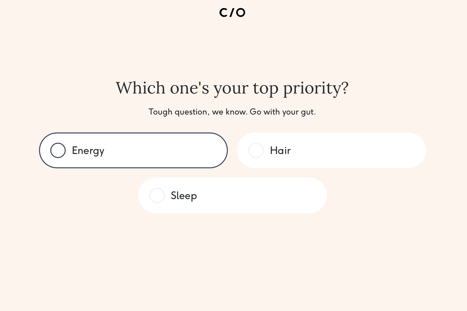
Outside of the telecom category I liked the experience at care/of, which helps users create a customized vitamin and supplement packet through a quiz-like experience that collects information about you and your health goals. Although a bit lengthy, I think the specificity and detail was appropriate for the product, and the experience made the process angaging and fun :)
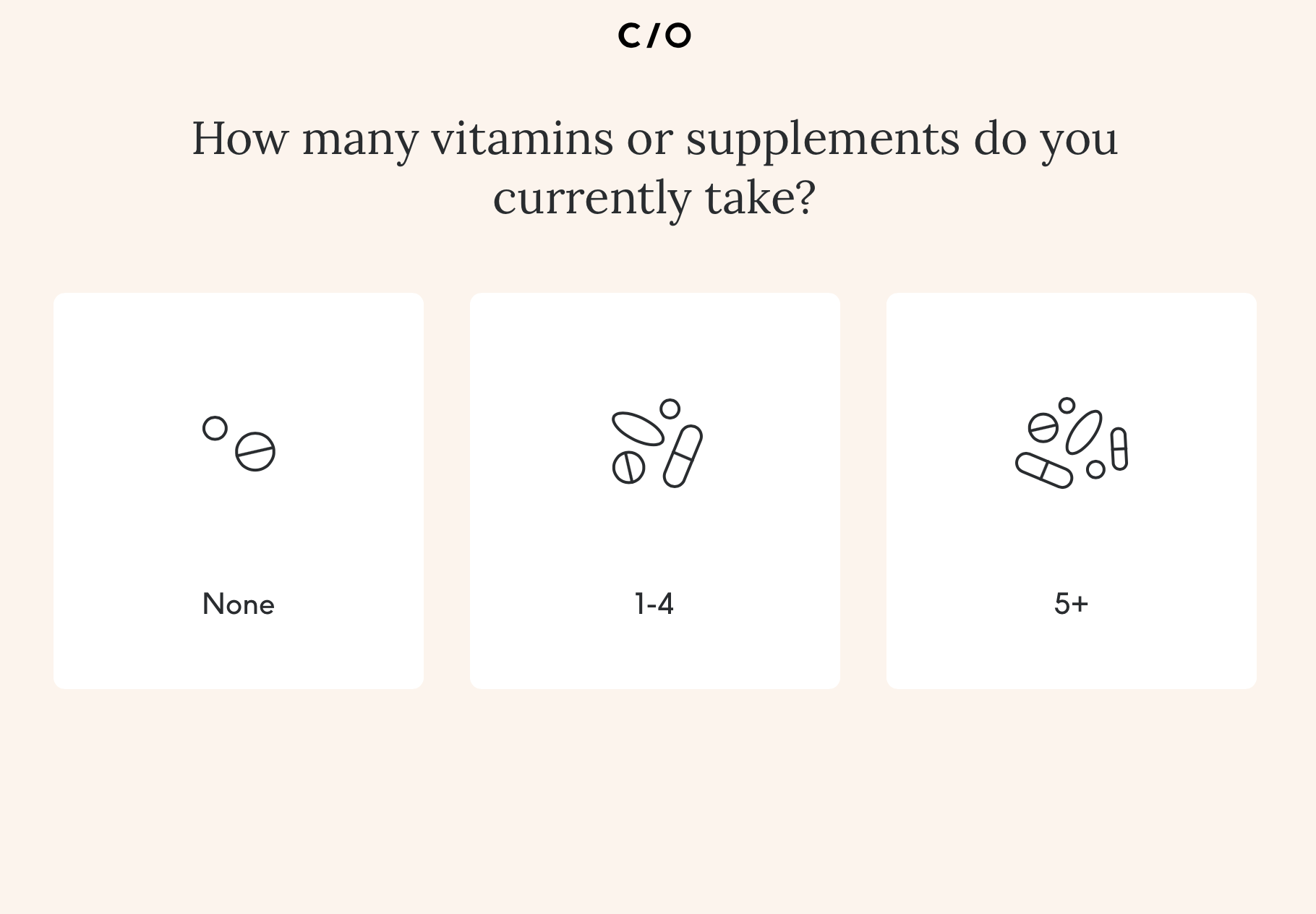
I also liked the Hello Fresh meal plan building experience. It was a good example of a much more to-the-point experience that still manages to bring some customization and delight to the experience.
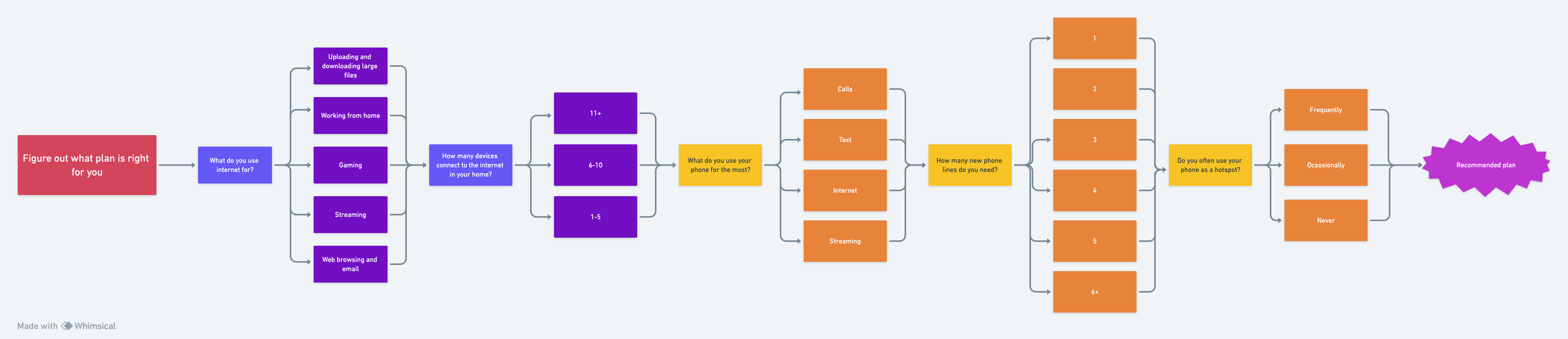
Thinking big
Taking inspiration from what I saw both in and out of the telecom category, I created a guided experience that would help users find what plan best fit their needs by answering a series of questions about their tech lifestyle. I thought this would be an elegant solution to help users navigate the complicated product bundle by taking away some of the mental load of figuring out what plan they needed with all the combinations and options. This part of the experience didn’t end up being in the budget for MVP launch, but it became an aspirational experience that was eventually achieved down the line.
Crafting the MVP experience
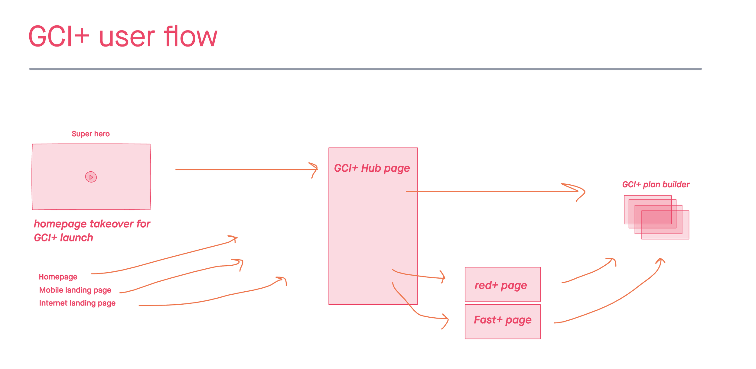
I started to architect the experience at a high level by creating a user flow in InVision Freehand that indicated the different paths the user could take in the experince, starting with promotional drivers to the GCI+ landing page, and leading the user through the product landing pages and finally the plan builder experience.
Plan builder experince
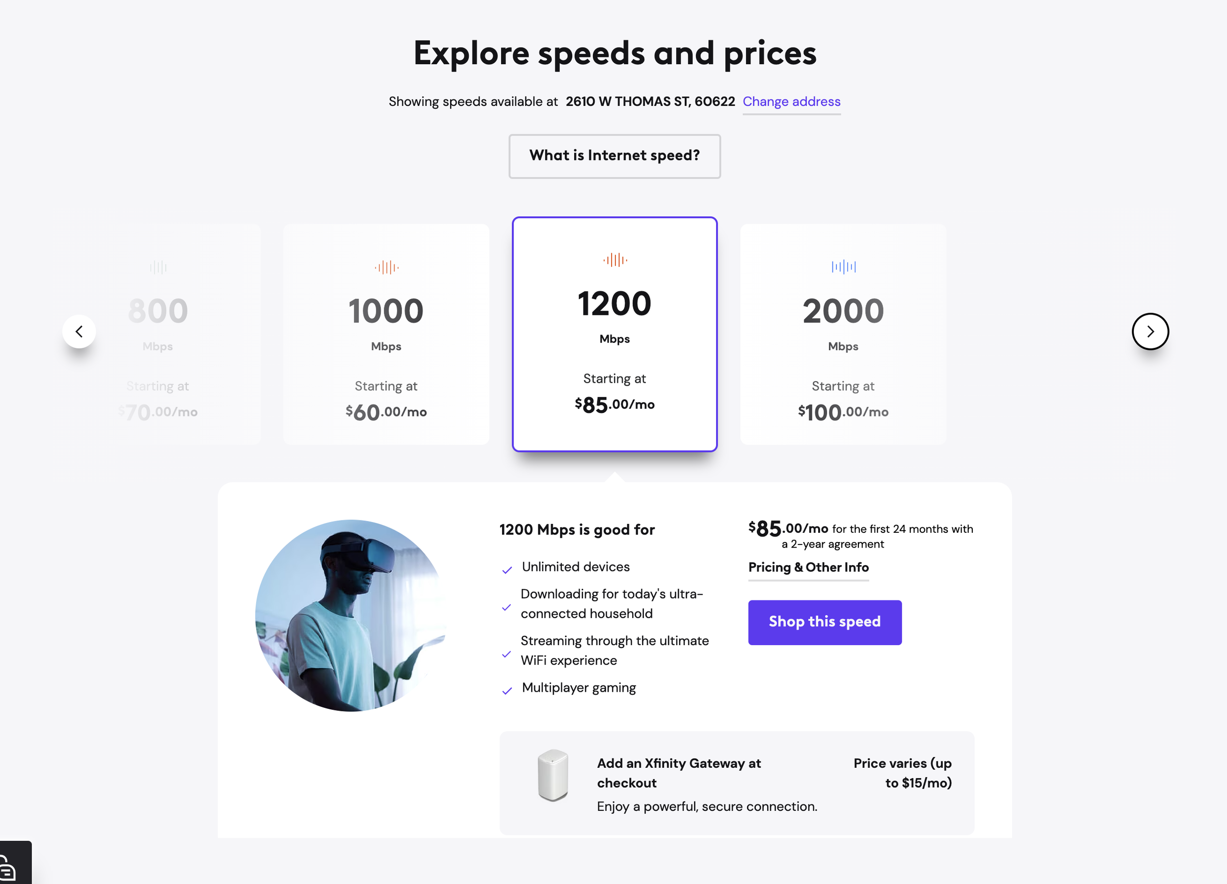
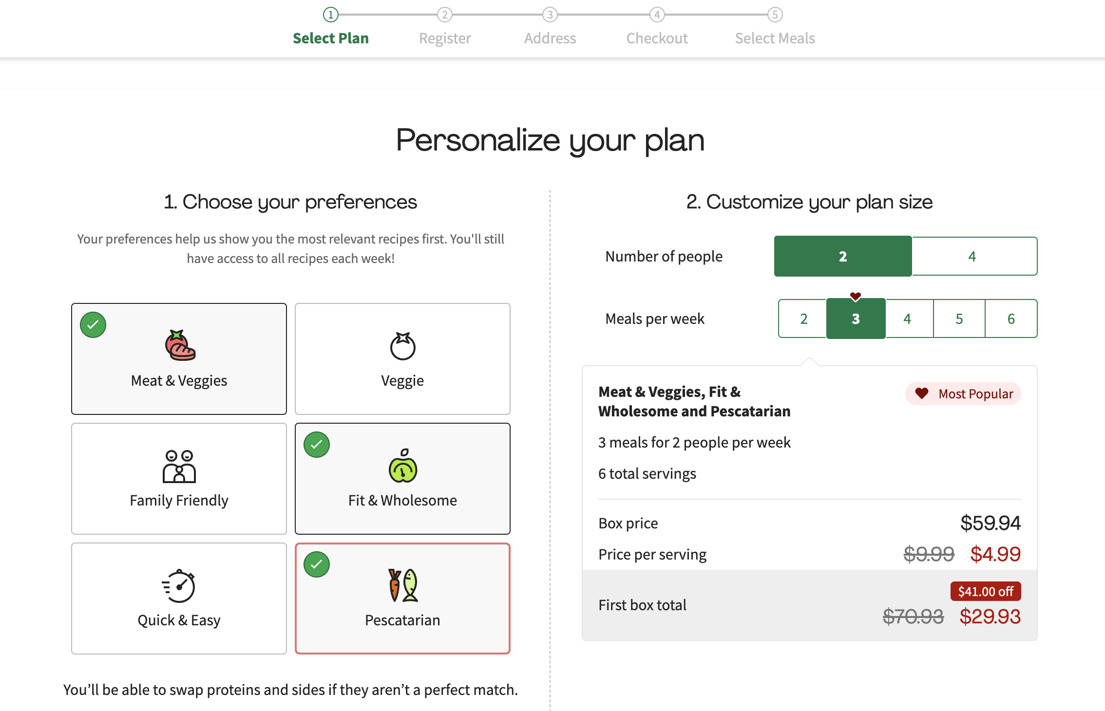
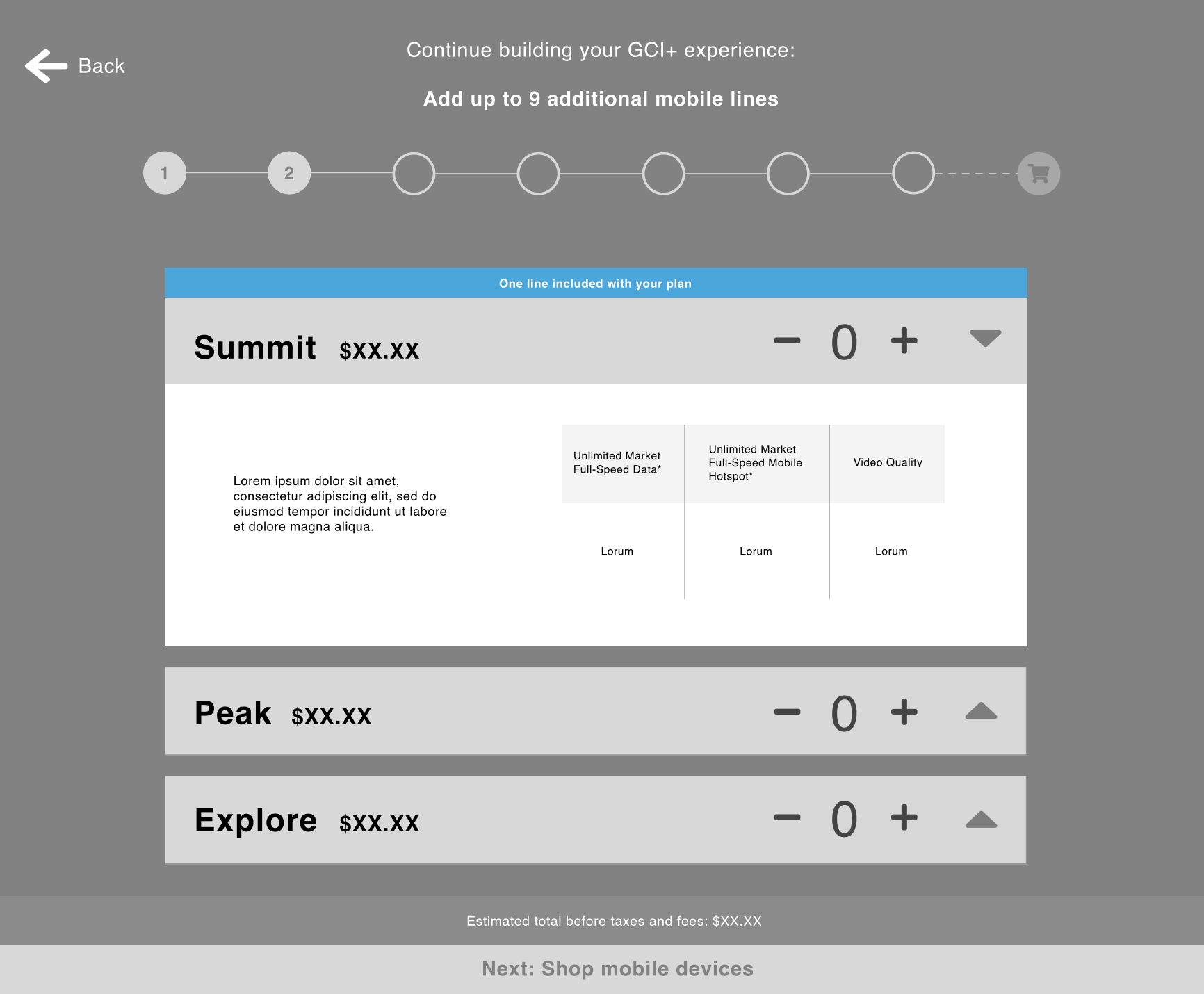
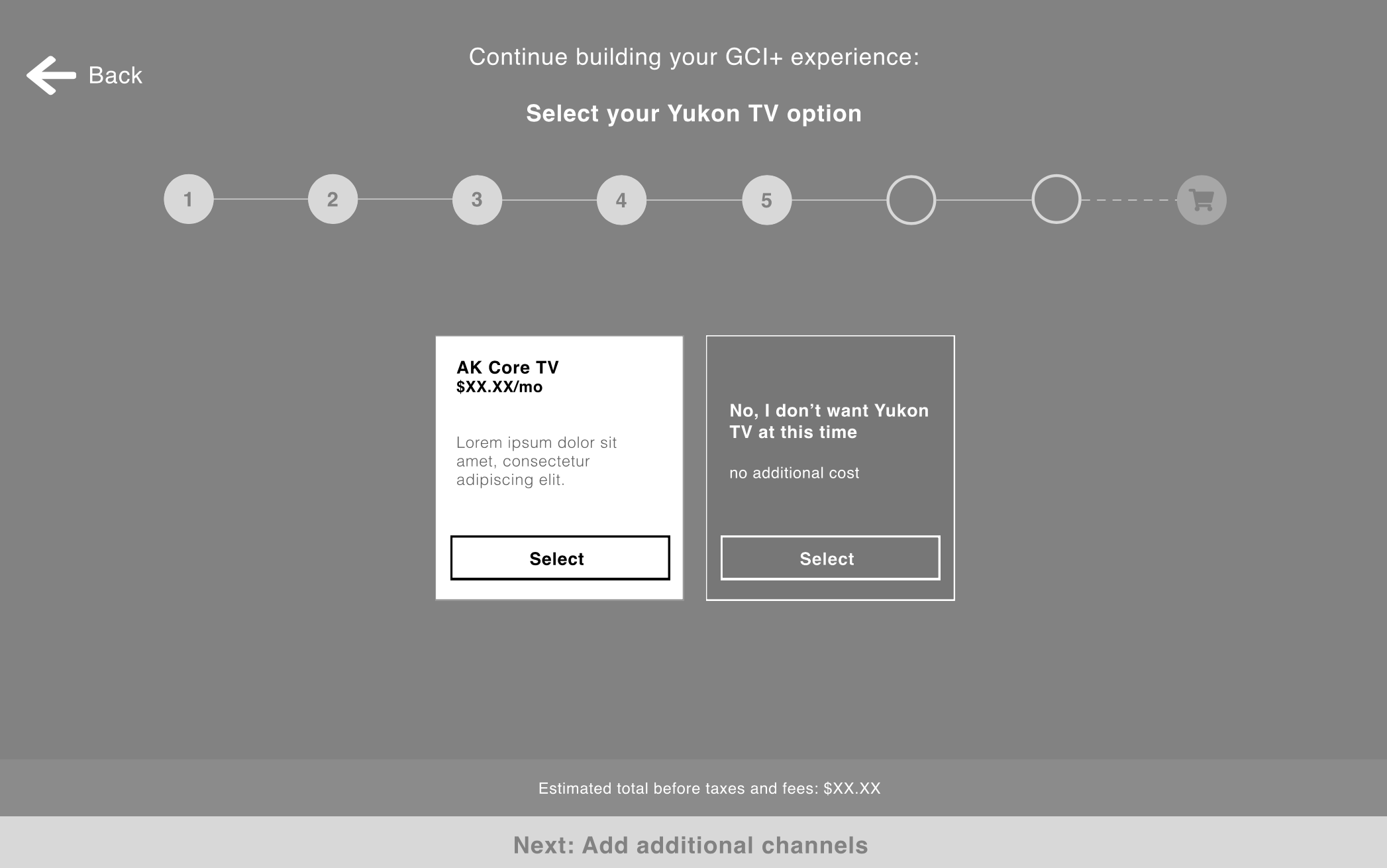
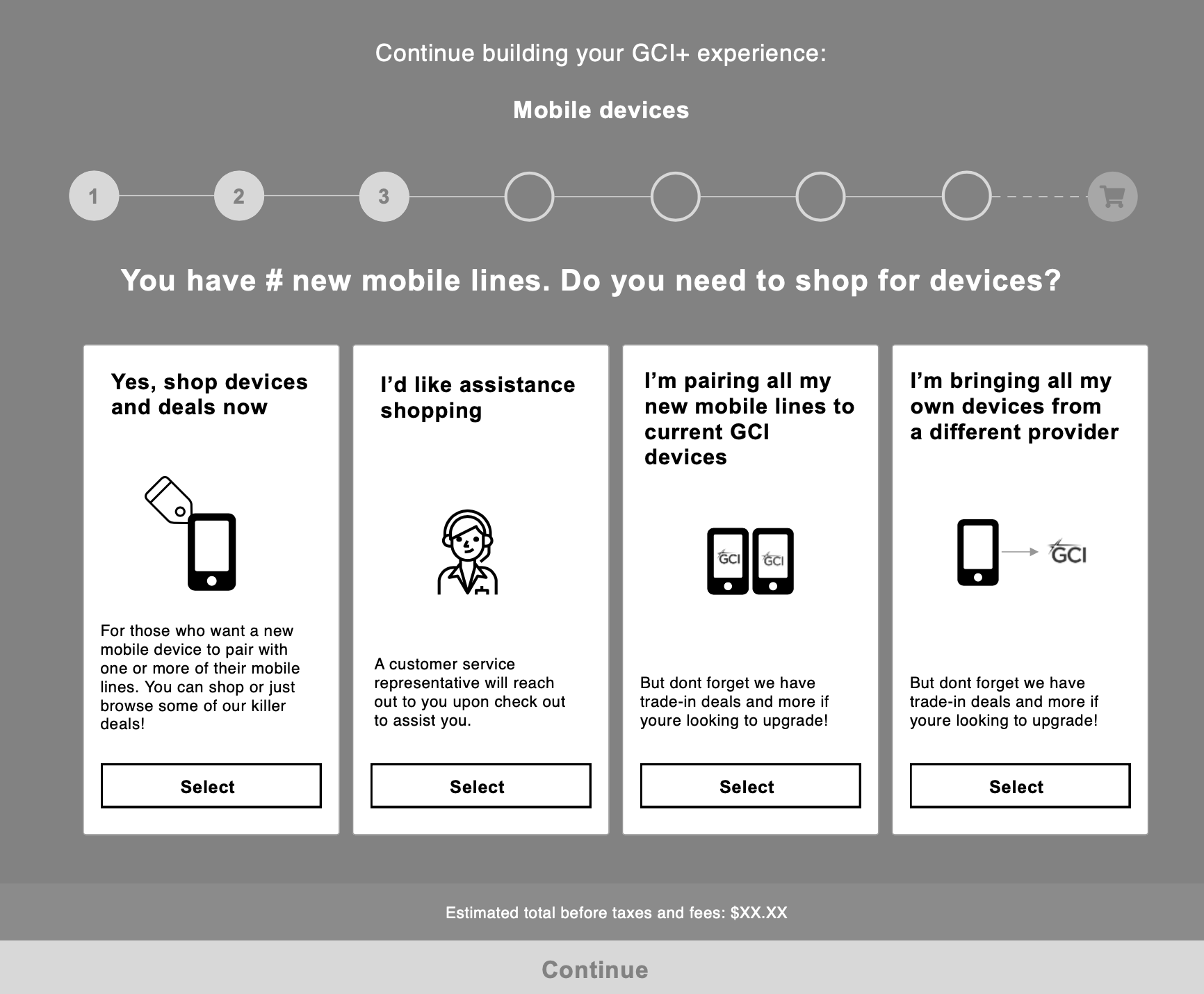
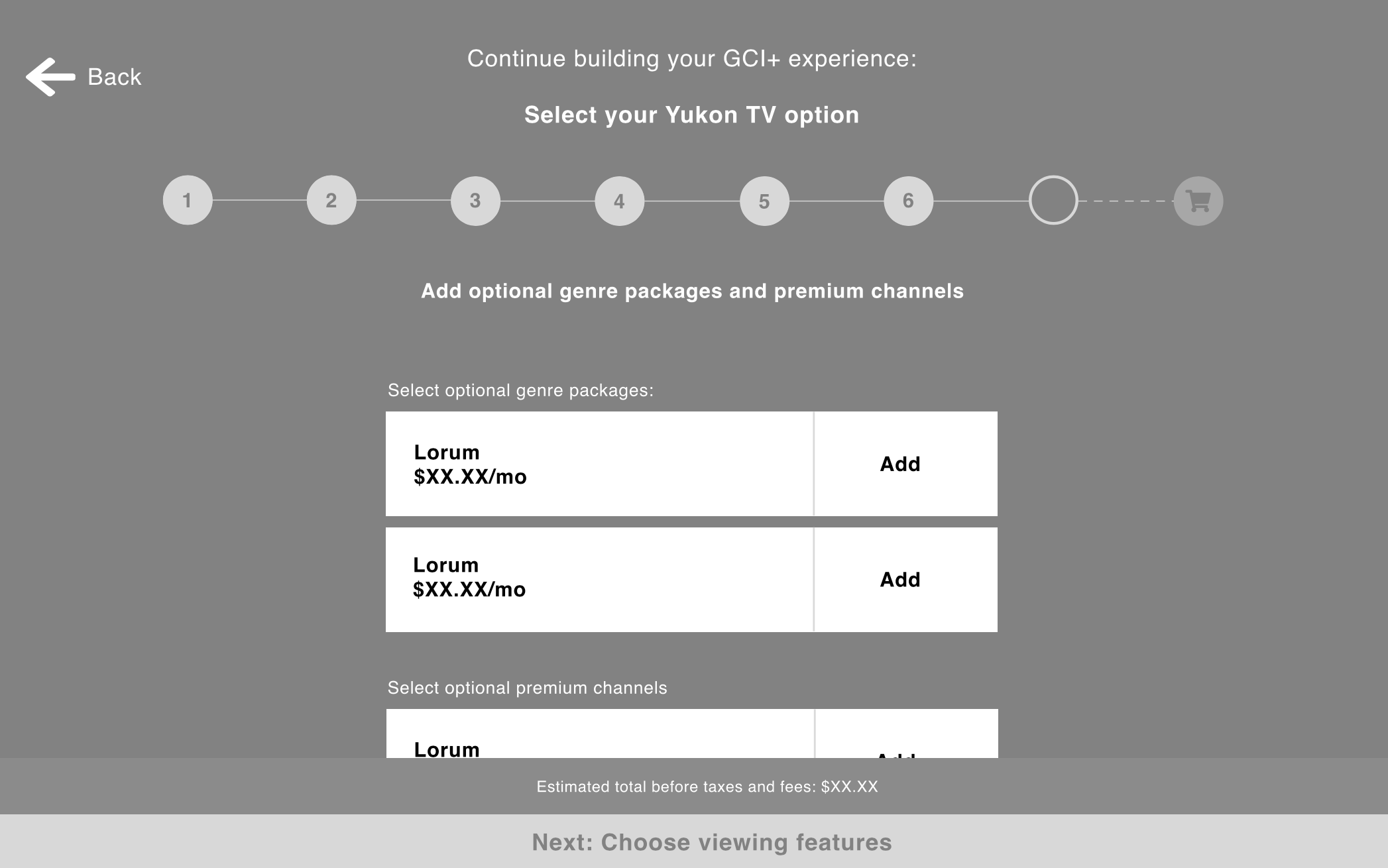
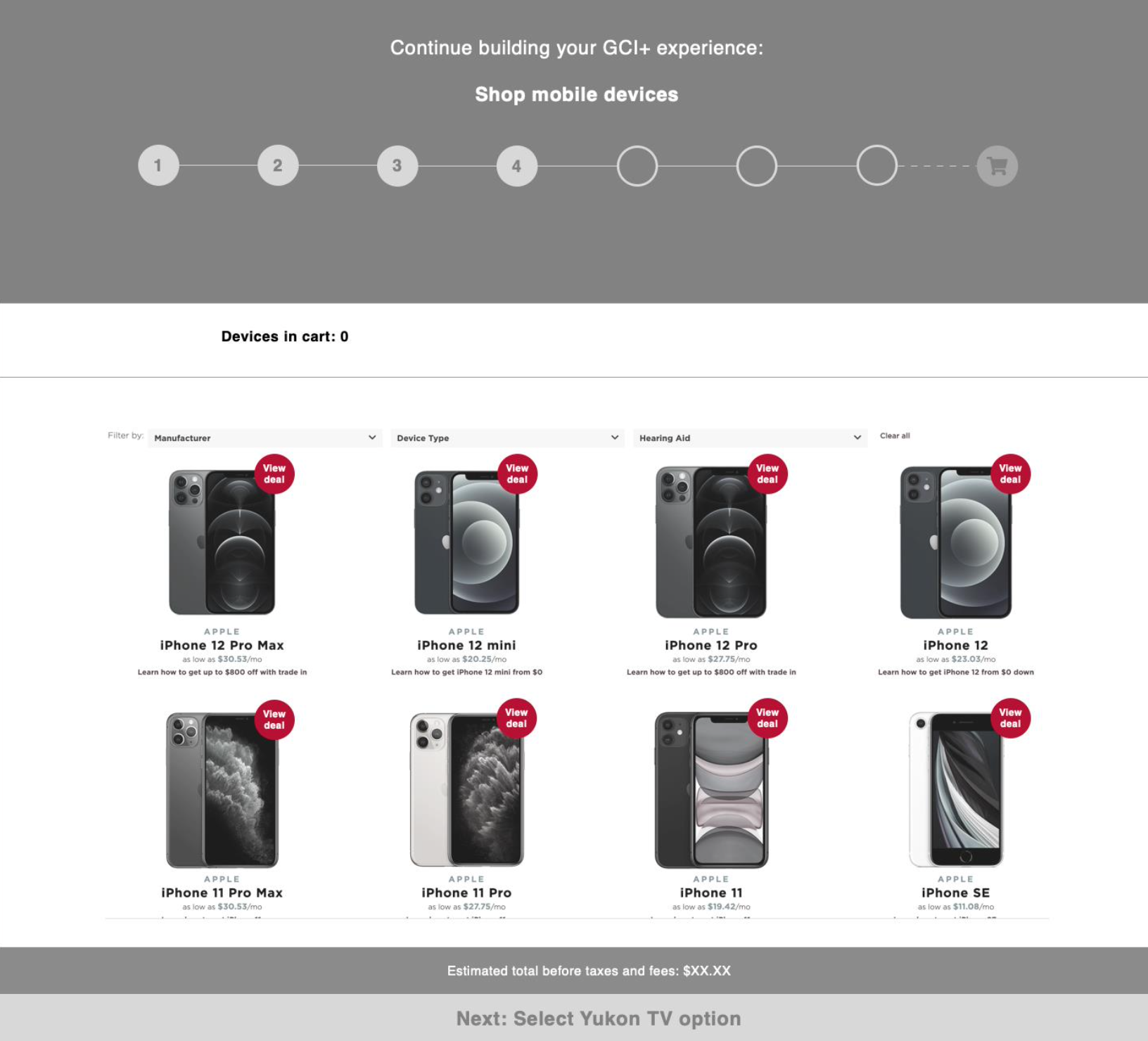
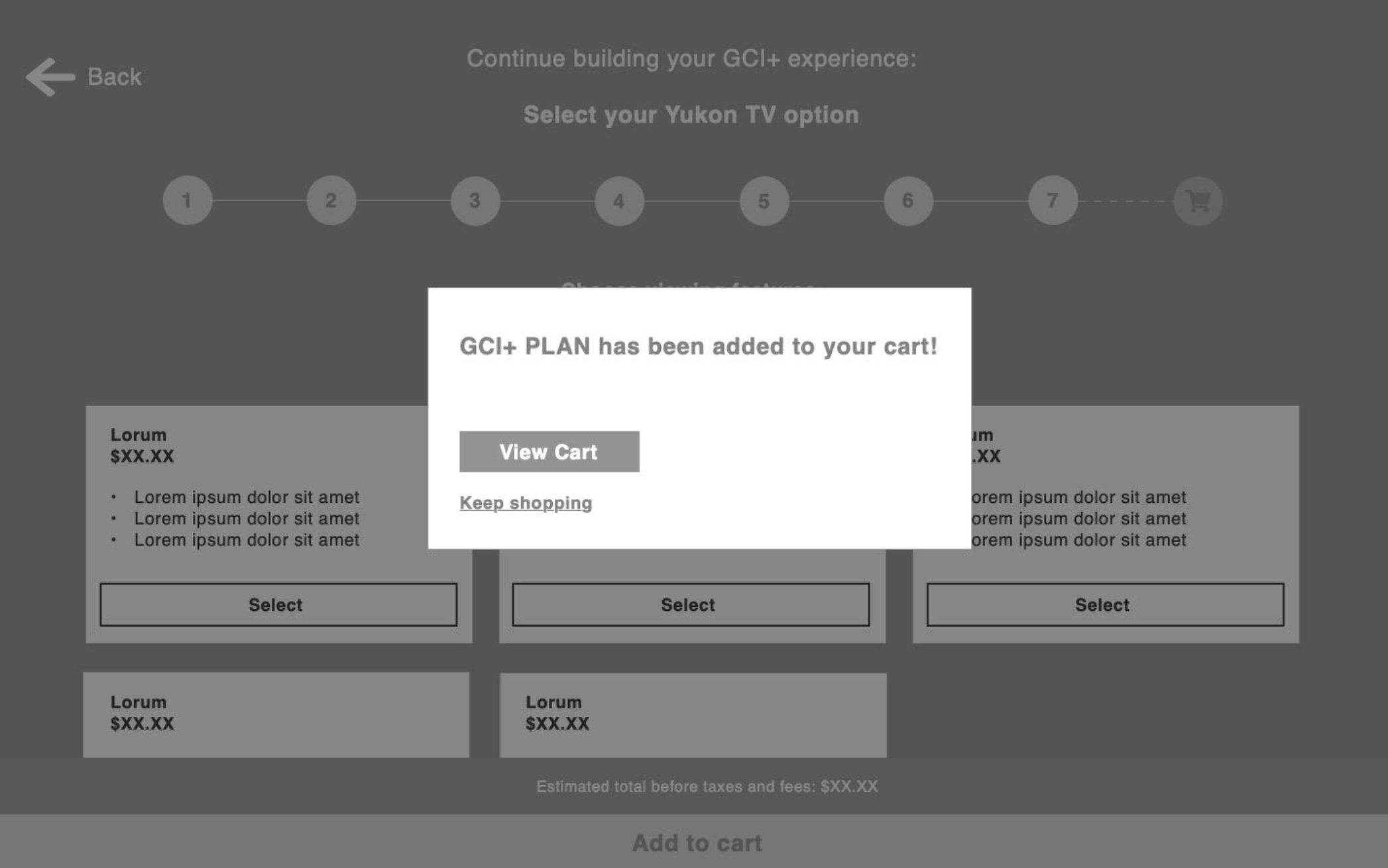
Tackling the plan builder for MVP launch was the most complicated piece of the project due to the product complexity, tech limitations, as well as the added requirement of being able to shop for mobile devices while keeping the user in the plan builder experience.
My strategy was to break down the plan builder into steps and give users the ability to easily bypass any steps that didn’t apply to them. For example, instead of bringing them to the phone shopping experience and allowing them to skip, we ask them if they need a new phone, and if they answer no, they never see the phone shopping experience and therefore reduce the possibility of overwhelm and fatigue. This approach also provided a personalized feel similar to initial guided quiz experience I proposed, but stayed within our development budget.
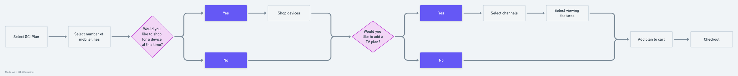
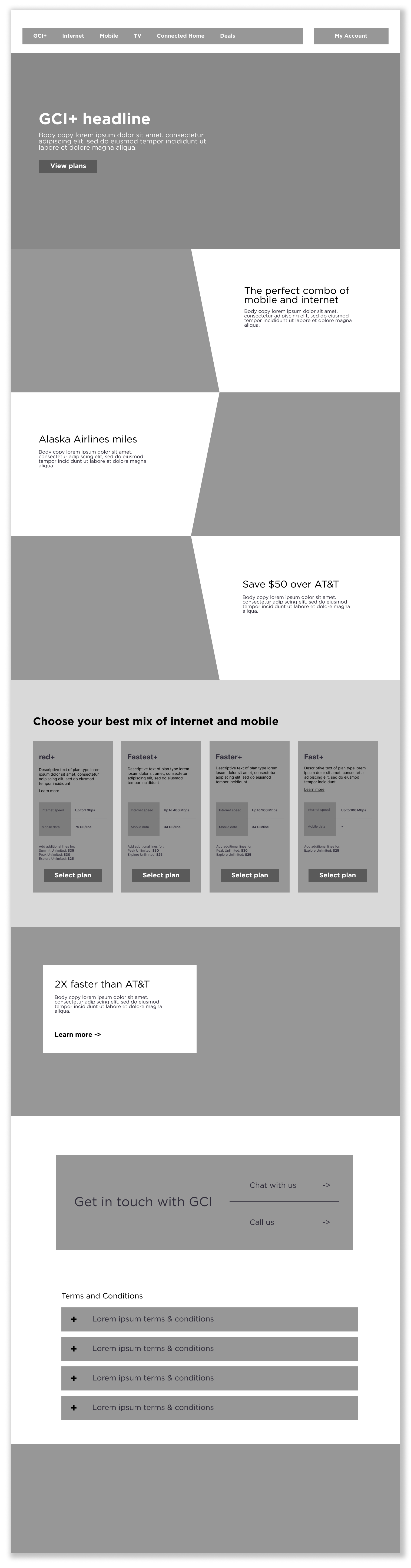
GCI+ plan builder and buy flow
GCI+ landing page
When considering how to design the GCI+ landing page, a main consideration was that this was a net-new product that we needed to introduce to the users in enough detail that they could understand, but without bogging them down with details and jargon.
Content hierarchy
Before making wireframes or even thinking about components, it’s important for me to get a firm grip on the hierarchy of page content. So I met with the creative and strategy team to collaborate on an overall content hierarchy of the GCI+ landing pages.
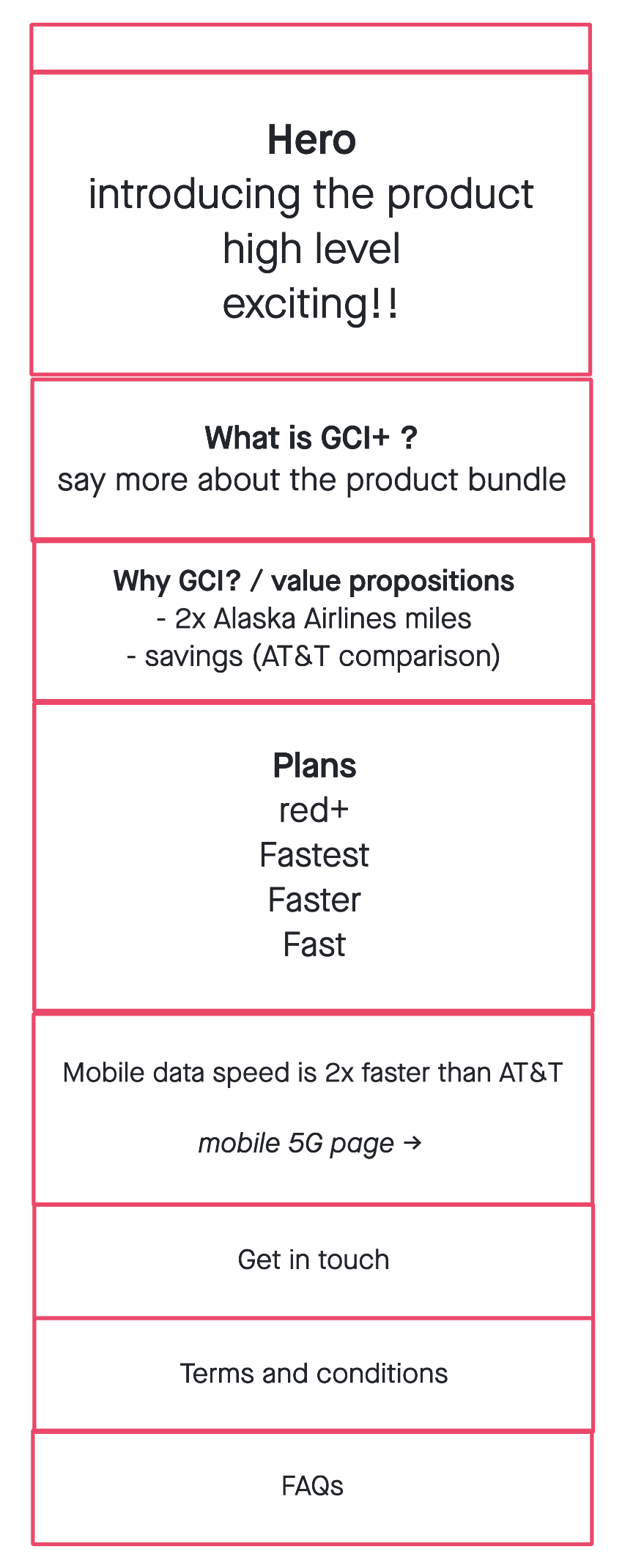
Mid-fidelity Wireframe
With a team consensus on what took priority content-wise, I then began to construct a low-fidelity wireframe of the types of components I recommended we use to tell the story we created
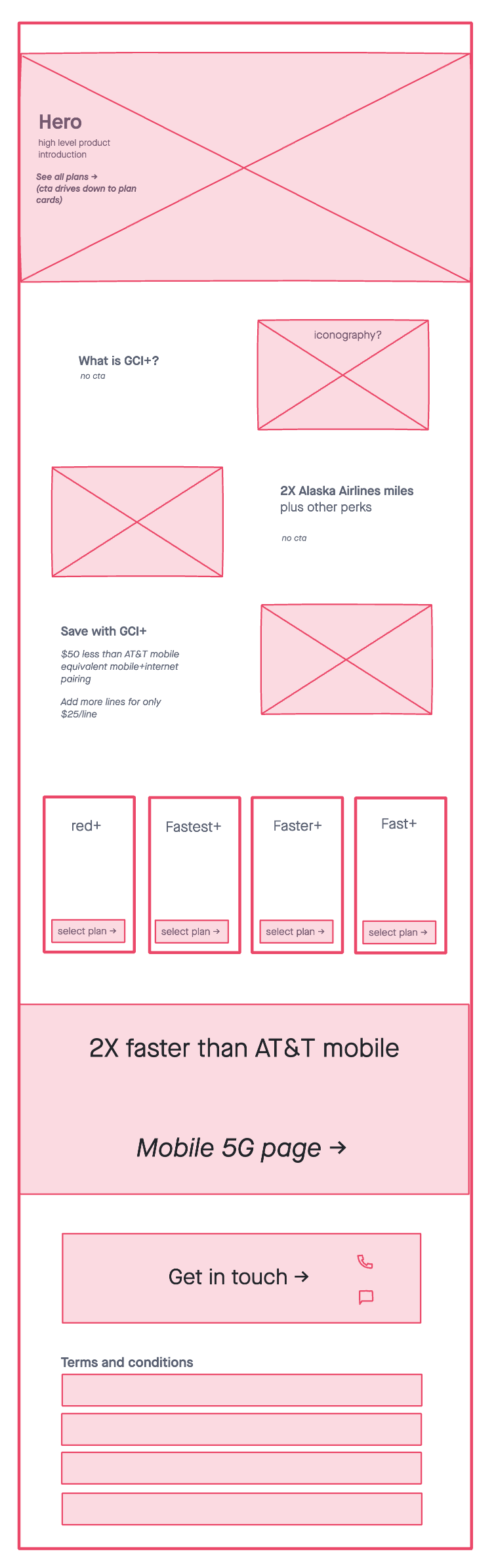
High-fidelity Wireframe
Then I constructed the wireframes we would share with the client. I worked with a copywriter to include directional copy in the presented wireframes to help tell more of a story, which in turn gave the client something more concrete to react to and led to better feedback in the end.
✧˖° Lemon zest and sparkles °˖✧
The client leadership team said repeatedly they wanted the GCI+ digital launch to be full of “lemon zest and sparkles”, which was an interesting way of saying they wanted the gravity of the product to be reflected in the web experience. This wasn’t just any product launch. This was thee product launch. They wanted it to feel singular, special and delightful.
As the UX designer, with the budget to only create one net new component (which would be used on the plan builder) I had to think of how to use the toolbox of components we already had to make a big splash.
Zesty component solutions
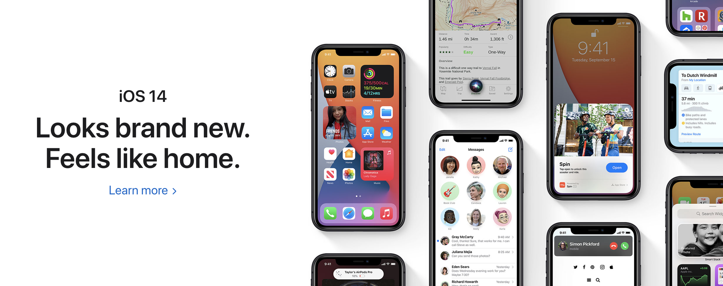
I took notes from high end brands like Apple to see how they approached their digital experience. Having products and icons fit in seamlessly with the page gave the page and the product an elevated look that I thought we could reproduce by using one of our main components a little differently.
My solution was to use what we called a ‘slant module component’ (which was a 50/50 component that used a slated image) and “hack” it to give it the illusion of a floating icon or image to match this elevated Apple look.
Regular slant module component with GCI core branding:
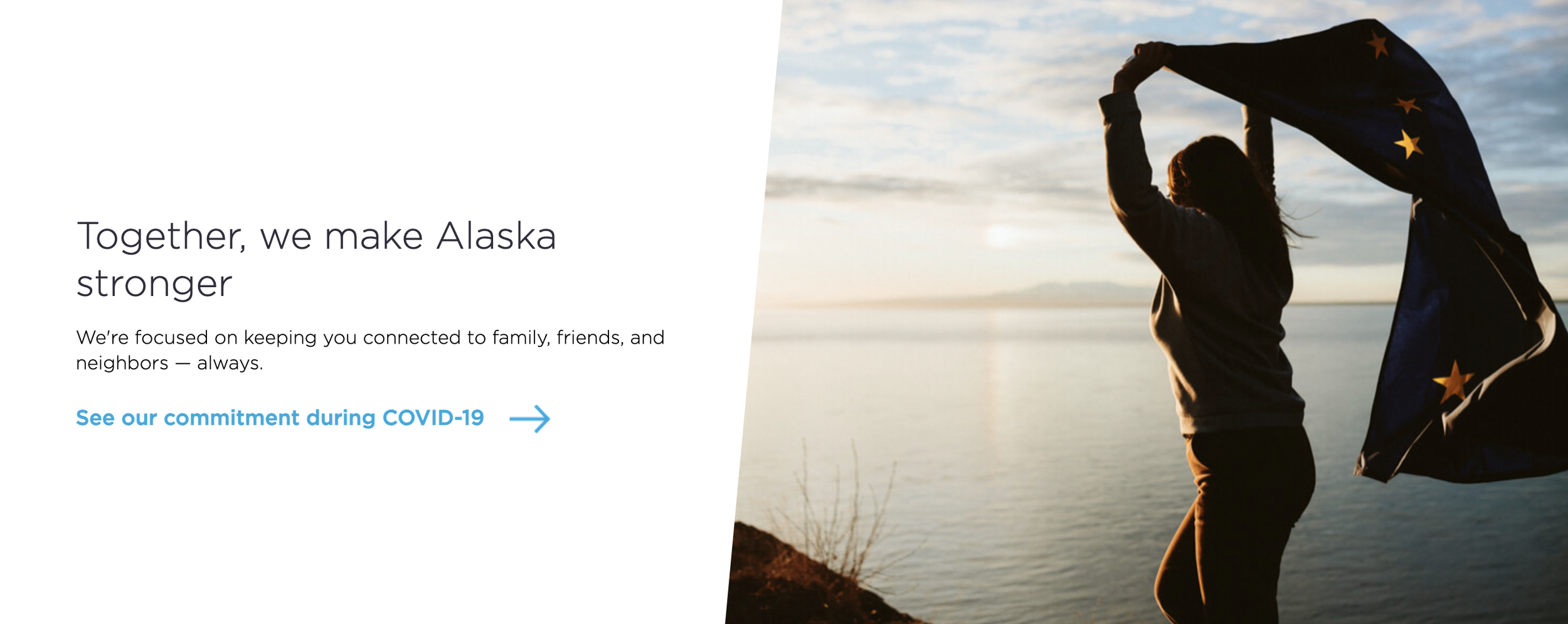
Zesty slant module component with GCI+ branding:
Landing page in design
Testing and improving
The client did not prioritize user testing for the GCI+ product launch budget. However, we started tracking the new experience in Google Analytics and Content Square to see how it was performing with users and used this data to pitch them an A/B test of the homepage and part of the plan builder.
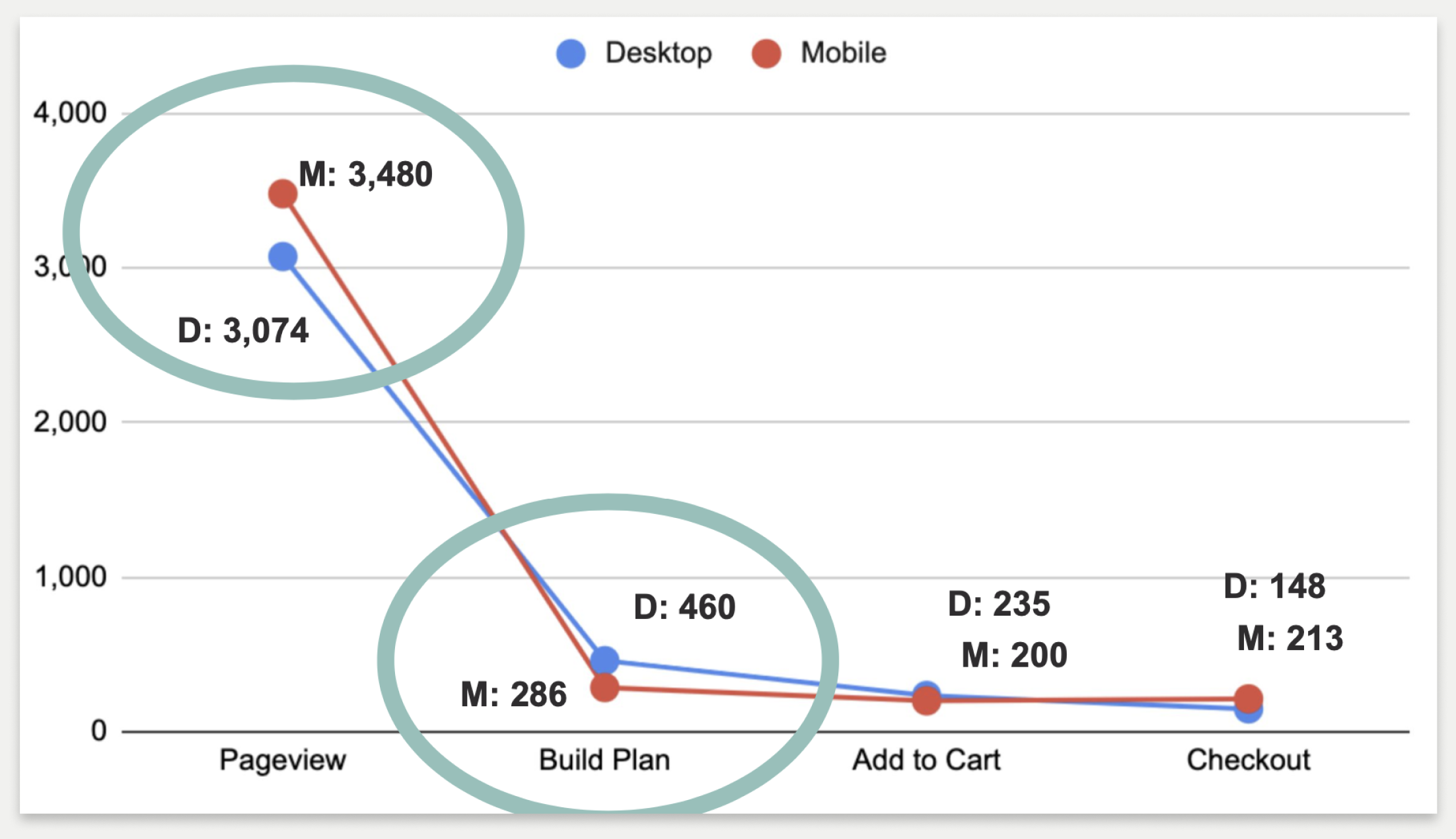
Click through from the GCI+ homepage into the plan builder experience and through to the checkout step
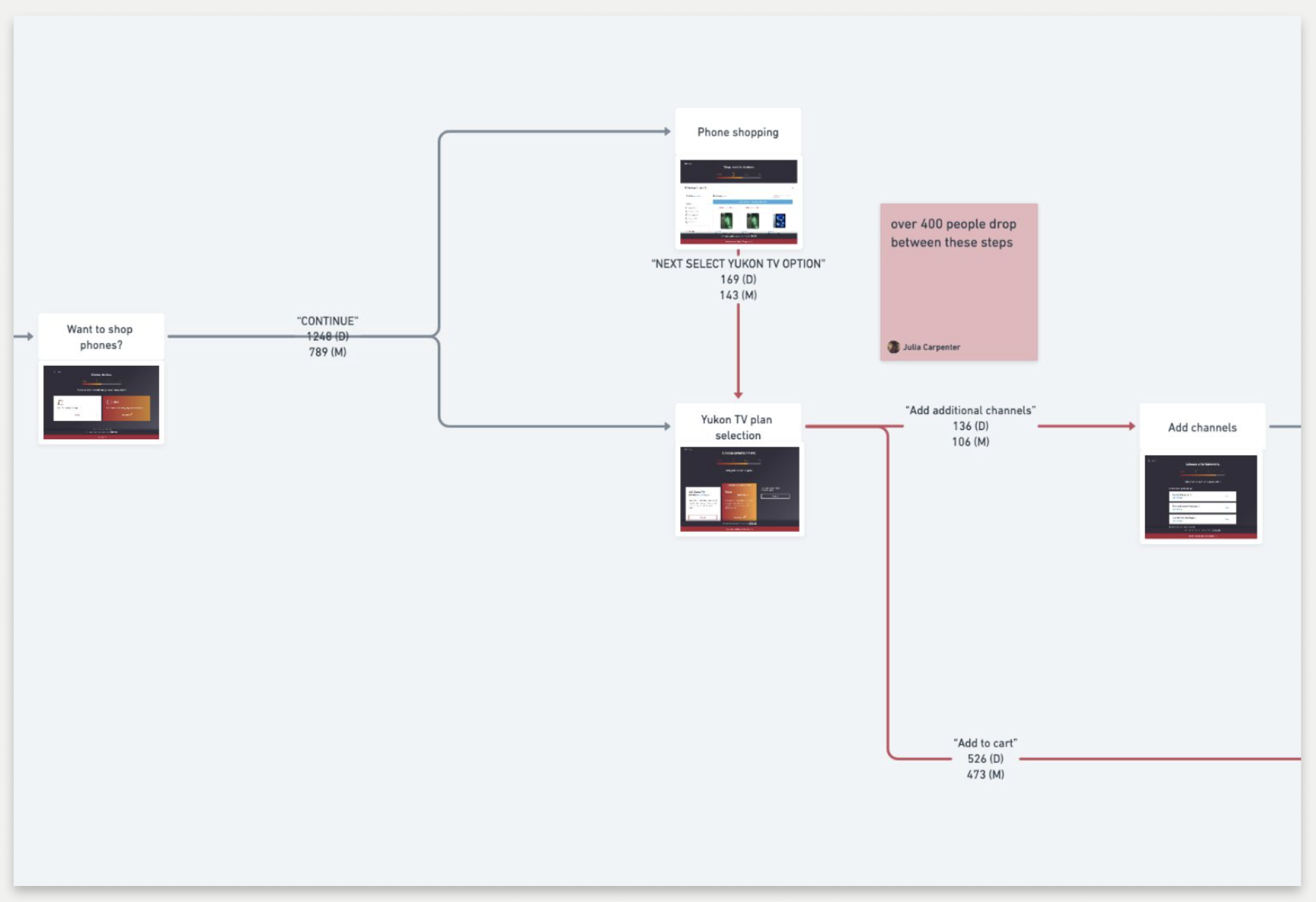
User flow depicting the click-through rate between the different steps of the GCI+ plan builder
What I observed:
Customers were ready to shop and did not spend a lot of time lingering in the value proposition area of the page (which took up a lot of space)
There was a high click-through rate into the plan builder from the GCI+ landing page
Lots of users dropped out of the plan builder when asked if they wanted to add TV to their GCI+ bundle
Seeing as most users were not lingering long in the value proposition area, or skipping it altogether, I recommended condensing that area of the page so users could more quickly view the plans.
They liked this idea, but there was some differing opinions about if this new value proposition area should ultimately live above or below the plan cards. A lot of the GCI stakeholders wanted the plan cards to be as close to the top of the page as possible, pushing the value propositions down, thinking that that would ultimately lead to the most conversion. However, my recommendation was to condense the value propositions but keep them above the plan cards so that the user could easily learn about why GCI+ was a compelling product before deciding to shop.
With dissenting opinions from GCI leadership, I proposed an A/B test to let the users speak for themselves. Whichever experience led to more conversion would be the one we would go with.
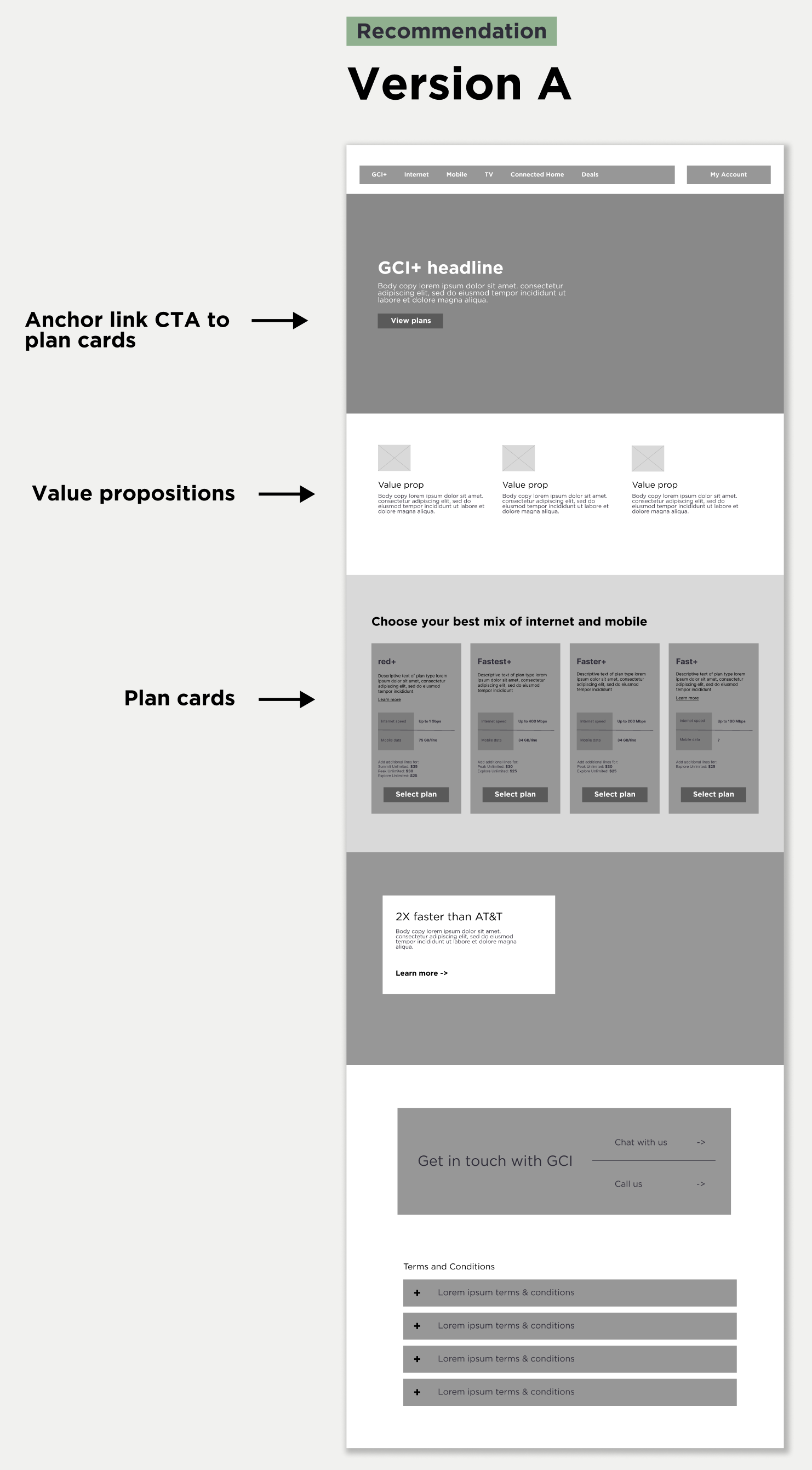
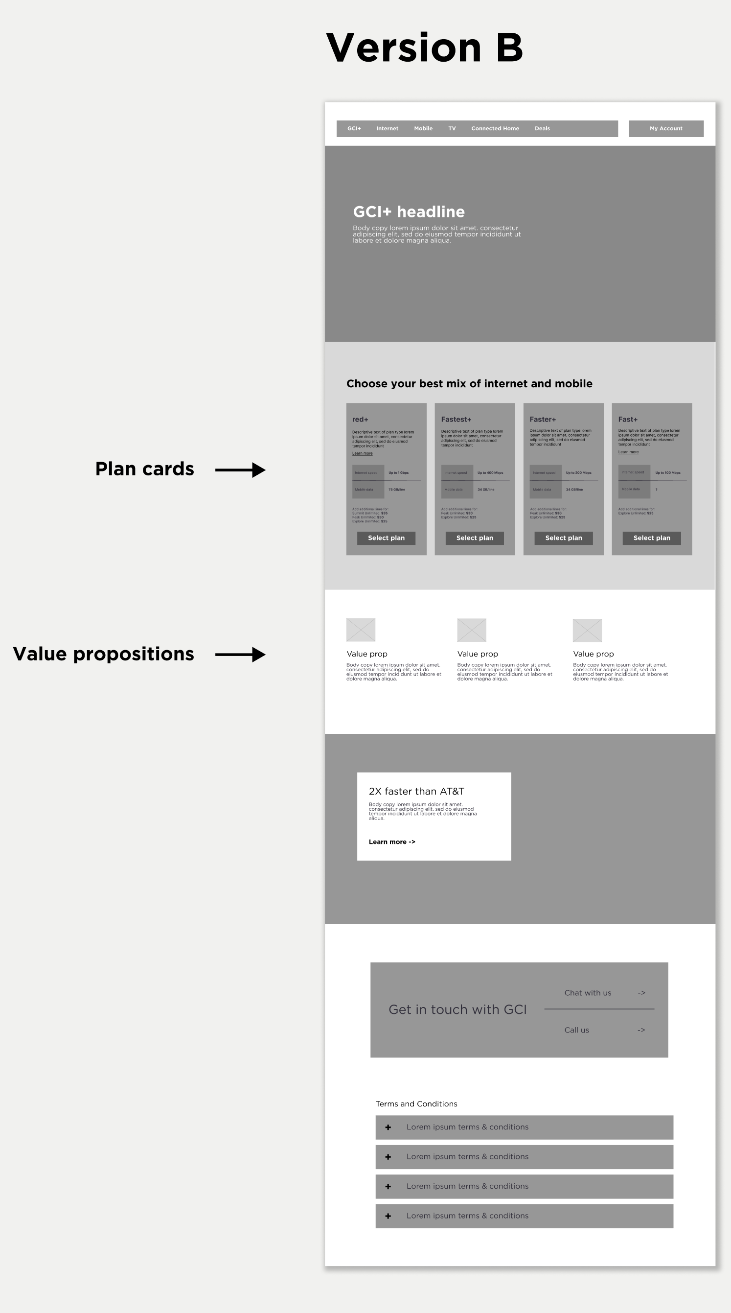
So, we ran an A/B test and found that condensing the value props increased the click-through rate in either scenario, but conversion was ultimately better when they were placed above the plan cards. So we we went forward with that design. I win :)
The results
We ended up creating a more refined landing page experience that dramatically increased conversion (from 5.5% to ~7%) on the page while simultaneously creating a cleaner-looking and an easier-to-digest experience for the user.
In my time working for this client, the Horizontal team and I pushed hard for the integration of data analytics and testing to find ways to improve the site experience. With very little budget for user interviews, we found data analytics and A/B testing was the best way to make improvements to the site based on user insights and data.