Full site redesign for Plan International Canada
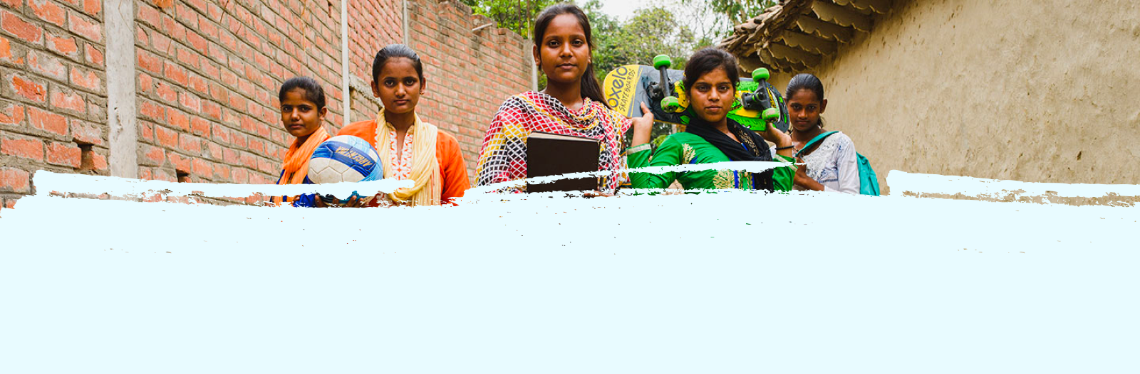
Client: Plan International Canada is the Canadian branch of a global non-profit with a mission of advancing children’s right’s and equality for girls
Project: Plan International was undergoing an entire site redesign that included a technology replatform and a total content overhaul. I was the sole UX designer on the project, so this meant coordinating with an array of teams to create a new site UX that met both user and business needs.
Project Overview
The Challenge:
We were taking over from Plan International’s previous design and technology vendors months into the project. This forced us into a “build the plane in mid-air” kind of approach and a highly hands-on collaborative process between us and the client team to meet their timeline and budget constraints. It seemed that Plan was changing everything all at once. A full site redesign, a total content overhaul, and even the foundational programs offered by Plan were changing. It was a whirlwind that required an extremely high level of ownership and leadership not only over my UX domain, but also into the business analytics and project management side of the project.
High-level goals:
Define timeline, deliverables and activities needed to bring the rest of the project to completion
Unify content, technological constraints, business needs and user needs into a cohesive digital experience.
Design and deliver page templates and components that give direction as well as flexibility for Plan to populate the new site after we hand off the project
Methodologies
Secondary research
Stakeholder interviews
User interviews
Results:
Deliverables
Wireframes
Component library
Information Architecture
Tools
Figma
Confluence
Jira
Research + Discovery
Stakeholder Interviews + Requirements Gathering
With so much to get caught up on, and fast, I organized a weekly team meeting with the Plan product owner and each week we included members of a different stakeholder group within the organization to conduct interviews about the different parts of the site that would be impacted by the redesign. This revealed a lot about the different, and sometimes conflicting, goals of each stakeholder group.
What we learned from these interviews was foundational to creating the new site experience, and from them came the first round of business and functional requirements that I collaborated on with the team business analyst.
I conducted UX audit of the Plan website to better understand the current site and what its strengths and weaknesses were. It was clearly a site that had been pieced together over time, and with that came a huge inventory of components, many redundancies, and a lack of consistency when it came to UX, content and design.
Current Site Analysis
Competitive/Comparative Analysis
Next, I took a look at the digital experiences of other non-profits, both those that focused on children as well as others, to find inspiration for the new site.
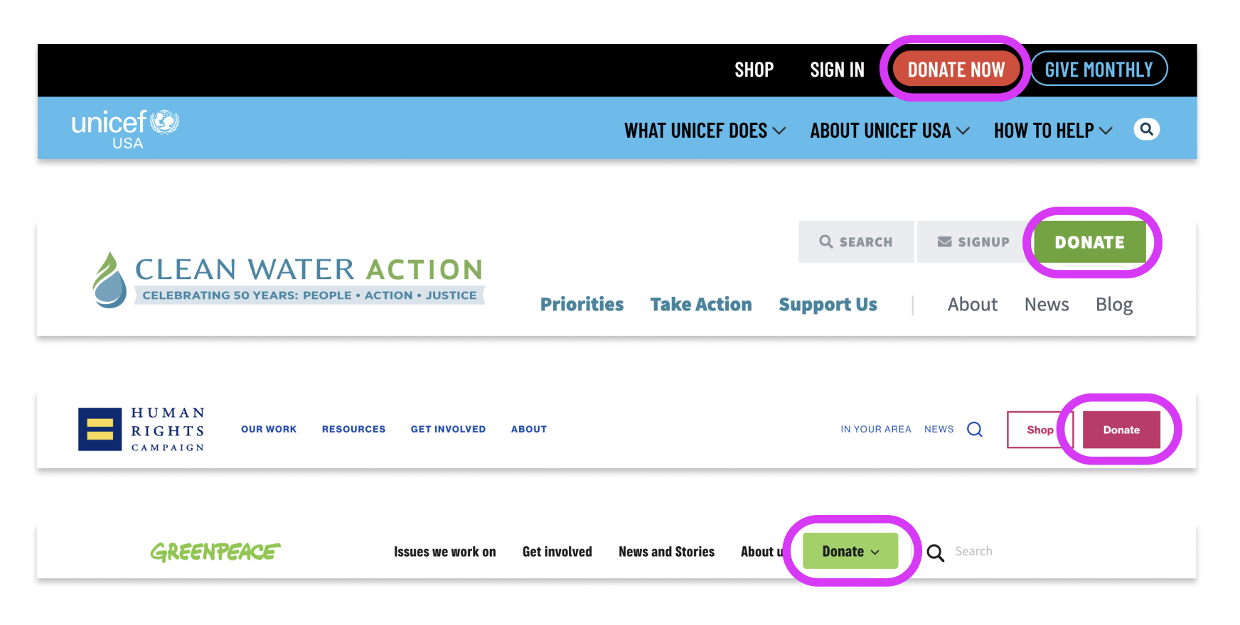
Donation form
A common feature I noticed for the donation form was to create a visually focused moment, which was done in a variety of ways, but consistently using a component and accompanying design that helped the user zero in on the donation form. It was often paired with a relevant image. These examples allowed the user to donate one-time, or monthly - as well as being able to click on different donation amounts or input a custom amount.
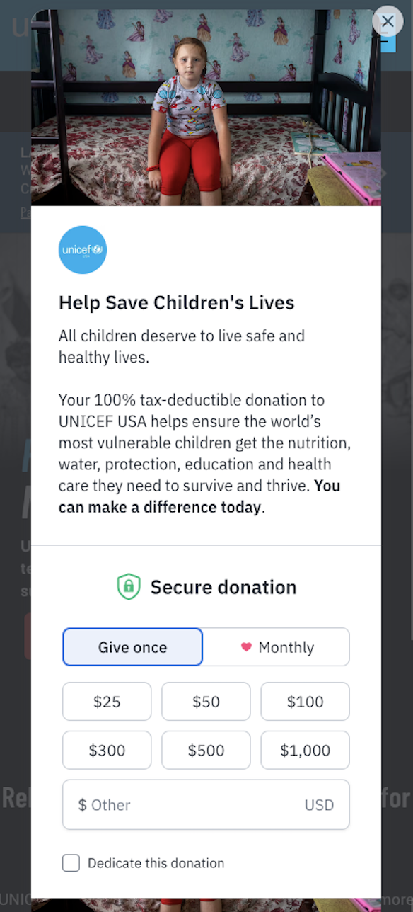
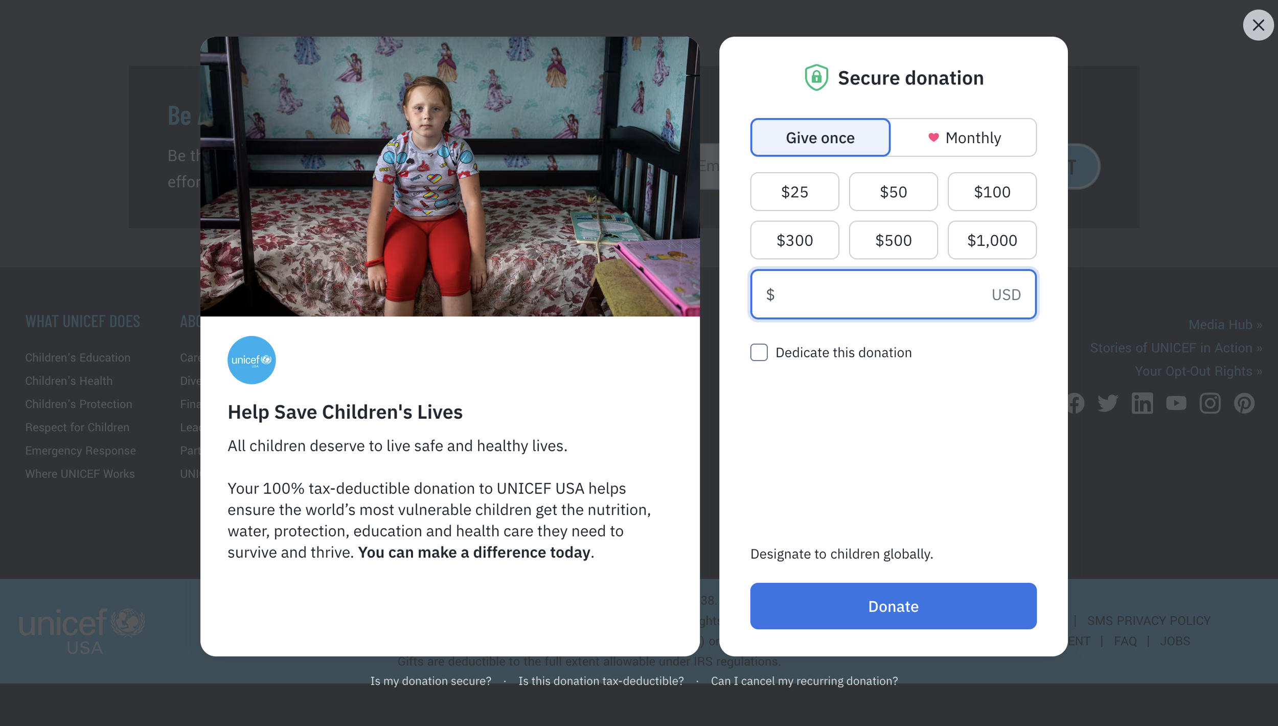
UNICEF
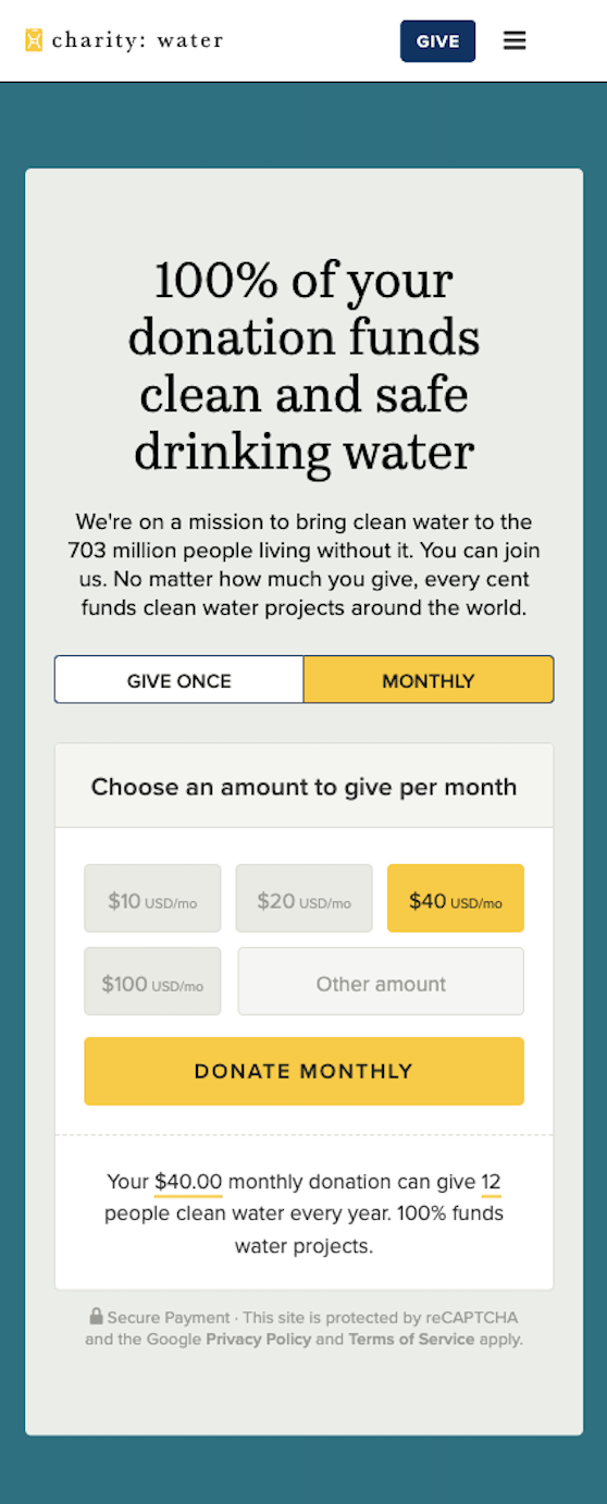
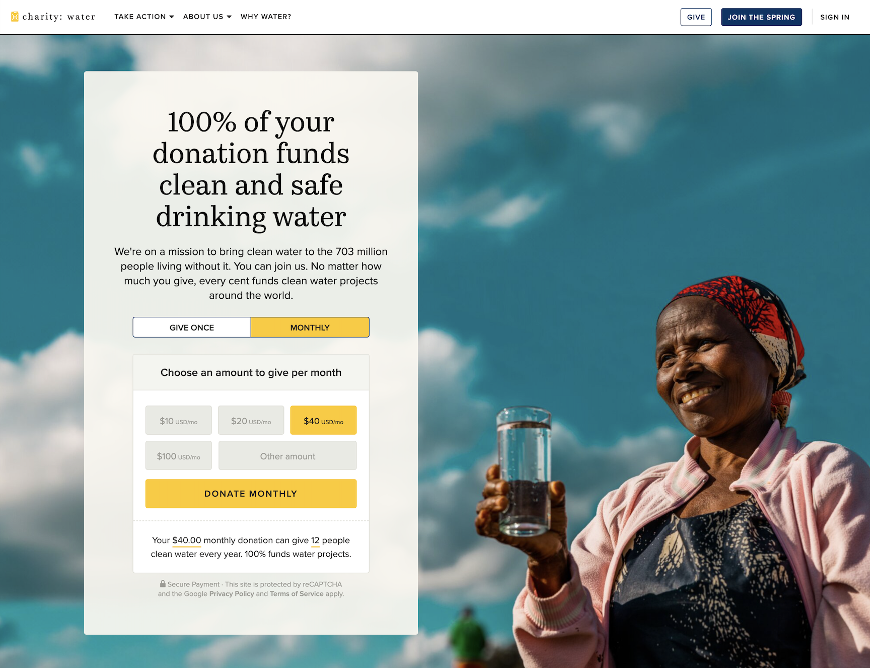
Charity Water
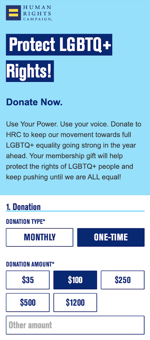
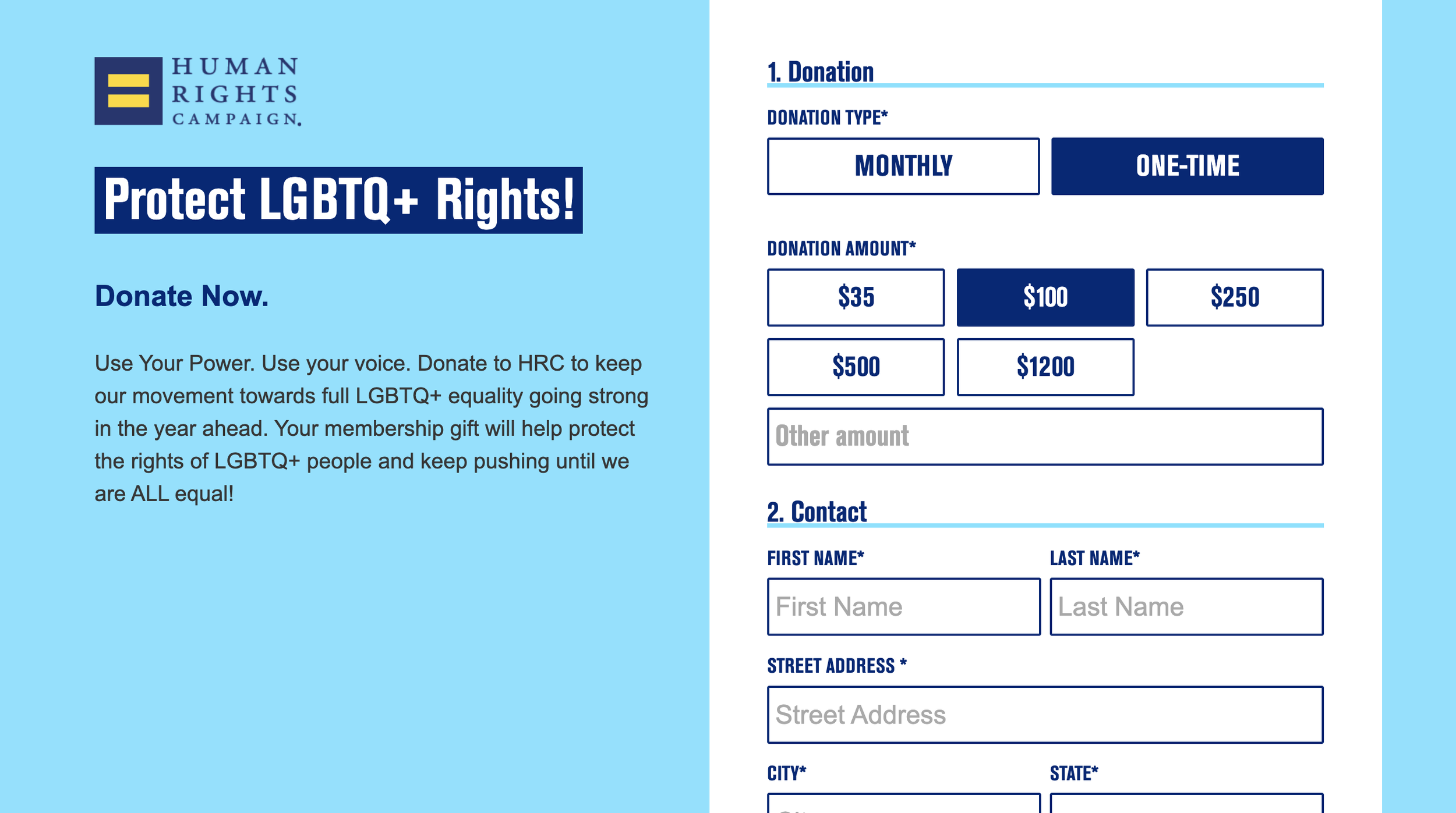
Human Rights Campaign
Paths to donation
I also noticed that the best examples I found had 1 clear, primary call to action in their navigation, which was something the Plan website navigation lacked and contributed to the disorganized feeling of their website.
Research observations
Streamline the paths to donation
We needed to create clear and encouraging paths to donation for users at all levels of the journey.
How?
Create a strategy for driving donors to and through the different donation paths
More focused calls to action that help the user start down the appropriate funnel and donate when ready.
Make content more ingestible
Create a UX approach that provides clear guidance on where content should be concise vs more descriptive.
How?
Collaborate with the Plan content team around how UX recommendations and content strategy can work together to keep messaging informative but concise via
Create more visual consistency
Improve consistency between like pages and condense the amount of components being used to build the site
How?
Further audit the site experience to create a component and page template strategy that would help create more visual consistency and an easier site to maintain moving forward
The Plan website was overwhelming. There were so many different options for donating and it was easy to get lost down a rabbit hole of the different programs and campaigns. The site UX didn’t help funnel users to a place where they could easily donate to the degree that it should. Visually it was chaotic and it needed both a UX and design solution that prevented the cognitive overload it was currently giving users. There was a lot of good content that needed some refining and some UX constraints to help limit content in key areas.
My recommendations
Strategy and Execution
Templates
The plan was to create 15 templates for the site redesign in
Unsurprisingly, there was some confusion with the client, and even within our own team at times, on what the difference between a wireframe, a template and a page design was. The answer can really depend on what team you are talking to. But regardless of what was “right”, it was imperative that our expectations were aligned. This took a look of consistent communication. Some on the Plan team were expecting to see wireframes of specific pages, and our developers were expecting to see templates that they would then create in the CMS. In the end, we needed both. So we landed on creating 15 templates, each with an accompanying wireframe of what a page would look like using that template
There was a lot of discussion on the content team around how to go about creating the templates when their team was still in the thick of the content overhaul. They were new to the idea of a page template and were concerned about the flexibility it would offer them as the specific content for each page would not be created till further down the line.
“You can create good experiences without knowing the content. What you can’t do is create good experiences without knowing your content structure. What is your content made from, not what your content is.”
Component audit
During the current state site audit, I began compiling all of the sites components and grouping them by functionality and purpose to find opportunities to condense. There was a lot of opportunity here, and a lot of places where images were being used in place of building the right component. This was an accessibility problem that we needed to fix.
This also meant going on the current website and finding opportunities to remove or combine similar components so that we could streamline the amount of development work needed to not only build the site, but also maintain it down the line.
I created a component library to make sure that we were accounting for all of the functionality needed to meet those needs within the digital experience.
This was a process that began as early as discovery, but really took off once I started creating the wireframes for the site templates.
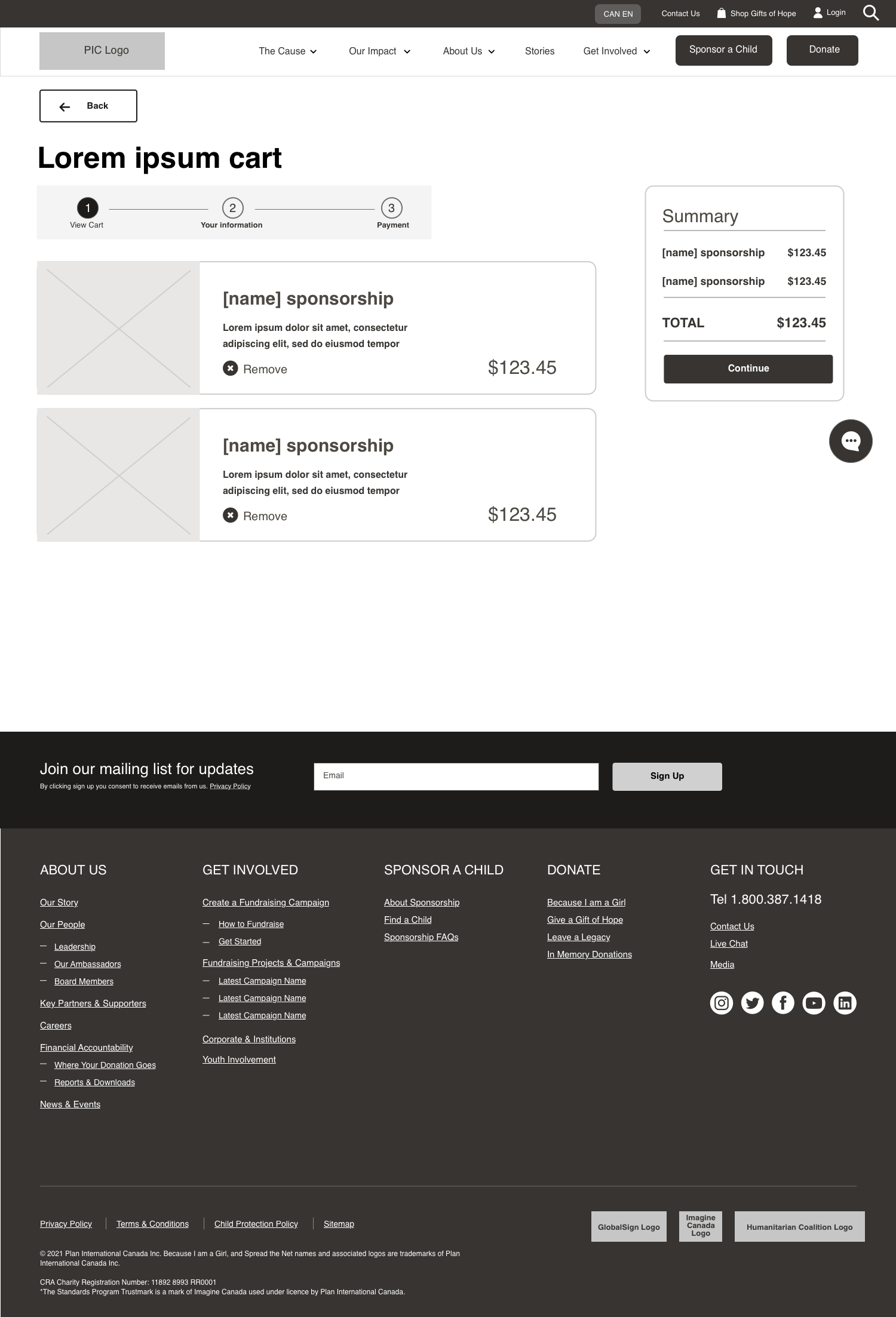
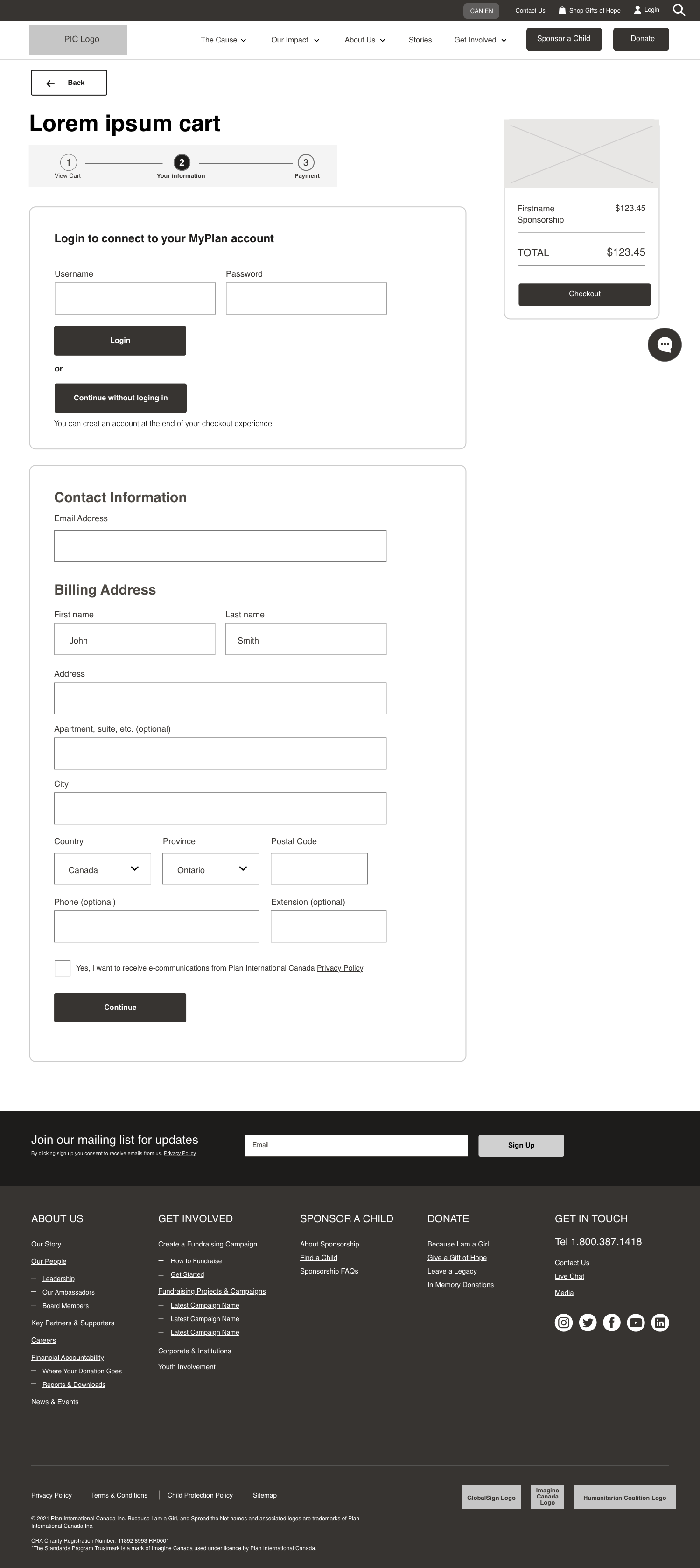
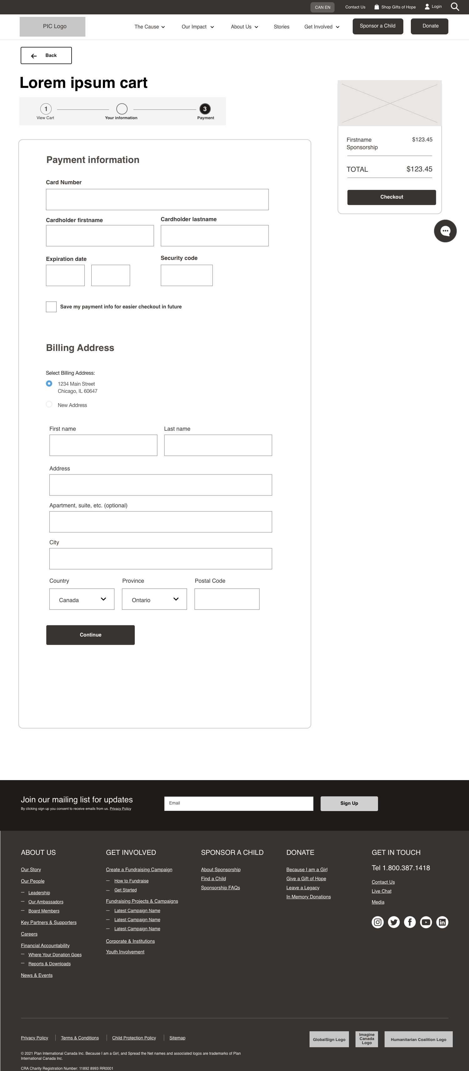
Donation and sponsorship flows
There were a lot of different ways to donate to Plan, including cash donations, child sponsorships, and donating gifts. To accommodate this, I had to design a donation experience that was built of versatile components to fit the needs of each of these donation types while accounting for logged-in states, account creation, as well as upselling donations within the donation flow.
Sponsorship flow:
Original navigation:

Observations:
Lack of visual hierarchy in the navigation makes it unclear what the main call to action is for the user
Using the program ‘Because I Am a Girl’ as a main call to action in the navigation could be confusing to some users who are not familiar with the program
It is not clearly indicated what is a button vs what is a drop-down menu
Despite hearing that ‘Sponsor a Child’ is their main program, it is not featured in the main navigation
Updated navigation:


The updated navigation solved the hierarchy issue, placing a clear emphasis one main call to action while still keeping the donation CTA present
Dropdowns vs buttons are clearly indicated
To help consolidate the navigation, the ‘For Sponsors’ content from the original nav is now handled on the Sponsor a Child landing page, which the where the primary blue CTA leads to
I removed the ‘live chat’ in the auxiliary navigation and turned it into an omnipresent floating icon on the page to improve visibility and de-clutter the navigation
I decided to remove the phone number since it was featured on the ‘Contact us’ page
a ‘Cart’ feature was added to the auxiliary navigation to help users return to any interrupted donation flows
Overall, we landed on a sleek, consolidated, and much more user-friendly navigation for the new site
Wireframes almost always depict a specific page, whereas a template can depict the layout of a page type, and many different pages use the template as a guide and a starting point.
What we ended up with was providing them with 15 page templates, and with each template we provided a wireframed example of a specific page that would use that template.