Designing new features for soona’s web interface
Client - soona
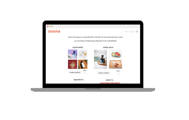
soona offers photo and video shoots to those looking for content to help sell online merchandise. soona's unique platform allows customers to attend shoots virtually, select individual photos or videos to edit, and then buy content a la carte at a competitive rate, all within 24-hours.
Methods
Competitive Audit
Stakeholder Interview
Tech Scoping
Dot Voting
Kano Method
Tools
Sketch
InVision
Deliverables
User Journey Map
Annotated Wireframes
Project Overview
The Challenge:
soona has a unique and attractive business model but their web interface does not facilitate a high level of customer engagement and conversion. The task was to identify and fill the gap between what the company was offering and what the user was experiencing.
High Level Goals:
Identify opportunity spaces within the current booking flow
Increase customer conversion rate
Improve staff understanding of customer needs and vision prior to photo/video shoot
Inspire the customer early on in the engagement process
Research + Discovery
Understanding the space
We jumped into research with a comparative audit, exploring the online presence and process of soona’s comparators. This would help us better understand the market they were working within and what approaches were currently being used. I love starting projects with this type of discovery… its a great way to gain inspiration, and also a good way to see what is already being done.
Stakeholder Interview
Our design team met with soona’s CCO and head developer to get an understanding of soona’s current state and gain insights into their immediate and future goals.
Meeting with the stakeholders allowed the team to learn about the strengths and opportunity spaces of the web interface from the perspective of company stakeholders.
Strengths
A high quality final product: edited photos and videos
A competitive price
Speed of service
Opportunity spaces
Customer drop off rate: users will start the process of booking and either drop off or they won’t buy their product at the end
Customers reach out to soona with a lot of question, indicating that their web interface is not clearly communicating what it should
Define
Understanding the user
User Journey Map
I now had a good understanding of what the website was seeking to accomplish, but I wanted to see it from the perspective of a user. I walked through the primary customer journey on the soona website and used the insights gained from this to create a user journey map and customer persona. These tools would help me visualize where to focus on in the customer journey and what features and interaction needed to be addressed as I started moving into ideating solutions.
Ideation
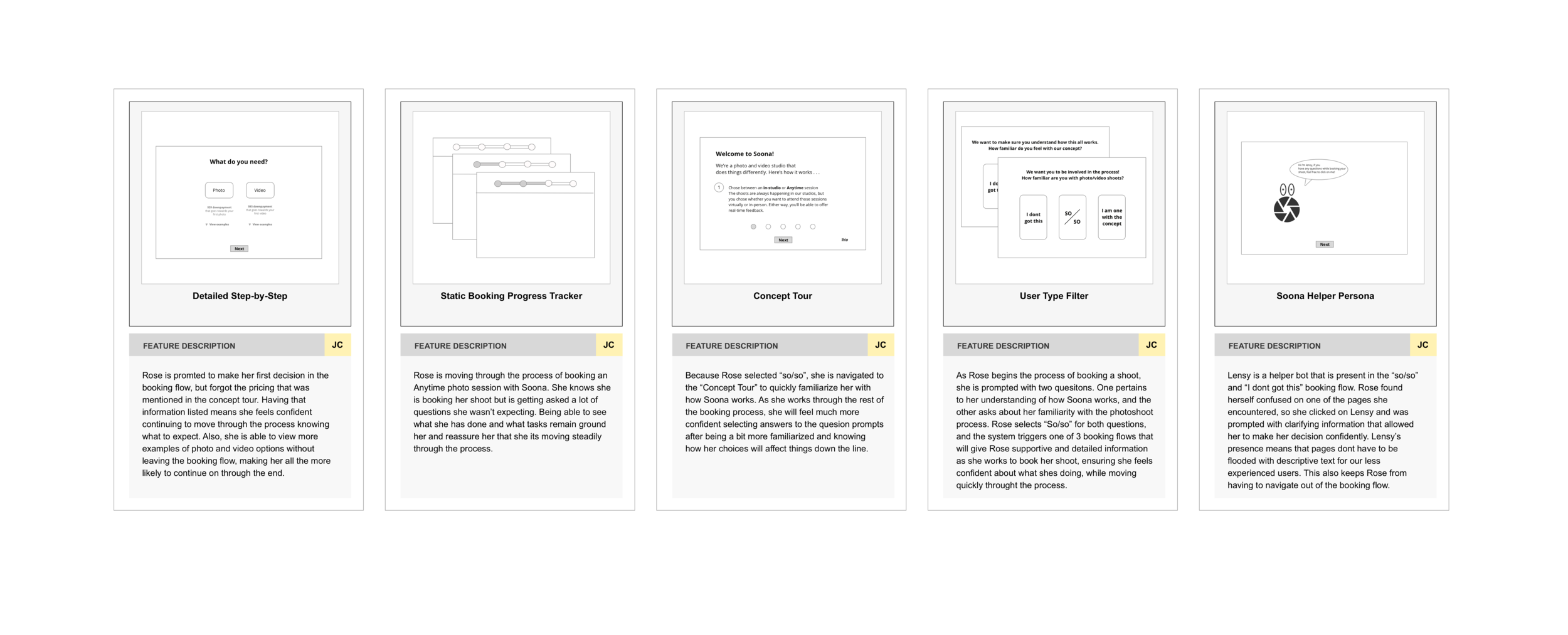
With a good foundational understanding of goals, painpoint and opportunity spaces, I began to ideate and sketch new features. Below are some of my low fidelity digital wireframes that aimed to improve the booking flow.
Research identified important opportunity spaces beyond just the booking process which led to recommended features across the entire web interface customer flow. My feature recommendation set focused on creating connectivity across different sections of the user flow in order to strengthen its cohesiveness and increase customer engagement.
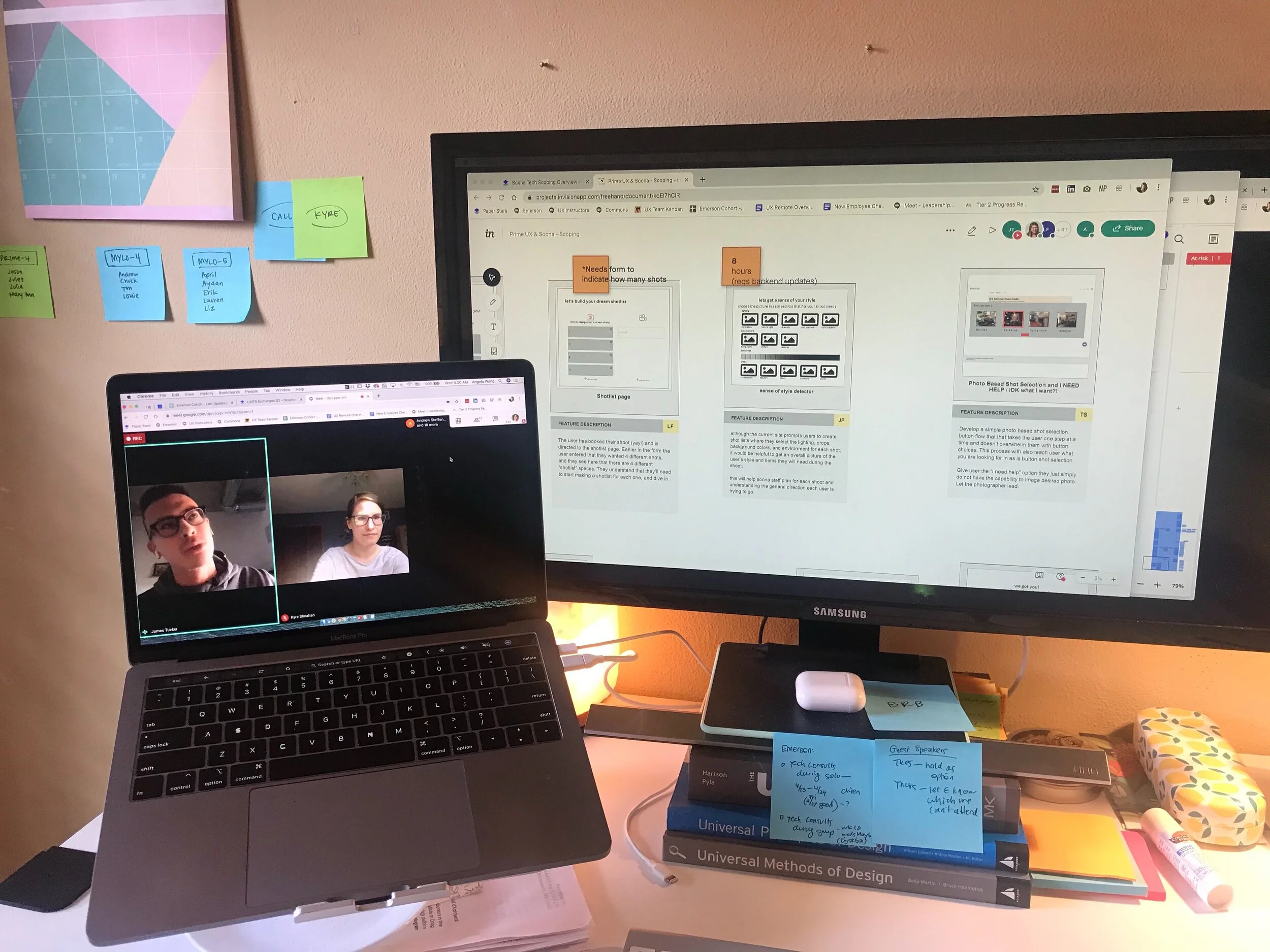
Each designer brought their feature concepts into InVision where we met again with soona’s head developer. One by one, development hour estimates were allotted to each feature.
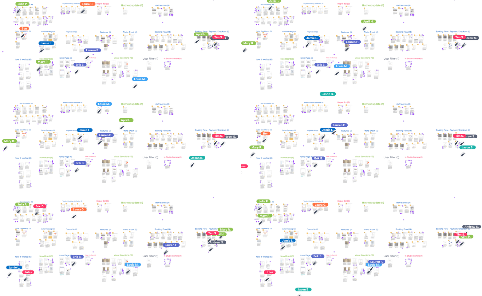
Features were then voted on by our team, using a dot voting method, to decide which feature concepts would be included in a kano analysis study. This study helps prioritize feature recommendations based on the level of desire the user has for them to exist or the level of indifference the user has in their absence.
Results from the kano analysis shifted my direction of focus from the booking flow to the overall primary user journey on the website. From my point of view, there were too many important opportunity spaces dispersed across this overall user journey to justify focusing on a single flow. With this new perspective, I curated a new set of feature recommendations that fit within the 40-hour development budget, including the highest prioritized features as indicated by the kano analysis.
Design team dot voting in InVision
The Solution
Recap + Reflection
The initial ask from our client was to improve the booking process of their mobile site. Something I would have done differently would have been to thoroughly explore the entirety of the customer journey before going heads down into the booking flow process. As it turned out, there were large opportunity spaces outside of the booking flow that were hindering the ability of the user to accomplish the end goal.
That being said, thanks to the collective effort of the team, these spaces outside the booking flow were identified and I was able to address them in my solution. This is why working on a team can be so valuable. It can be daunting to thoroughly evaluate the usability of a site on your own, and under time constraints. Delegating is a great way to be sure all the bases are being covered thoroughly, and to feel confident moving forward with your solutions.


